A new image of Babe Ruth to add to our "Pixel Parlor" illustration portfolio. We are helping a local Baseball fan to develop a brand that will spread the education, culture, and love of baseball. The project includes developing merchandise and this is one of three t-shirts that are in the works.
Promotion Posters for L'Etoile School
Brand Identity Update & Campaign for 2 Brothers
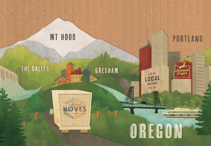
Lots of new creative for 2 Brothers as we evolve their brand and re-inforce the "Local, Long-distance, or Across the Nation" campaign. We're excited to help roll out this brand refresh over the next year or so.
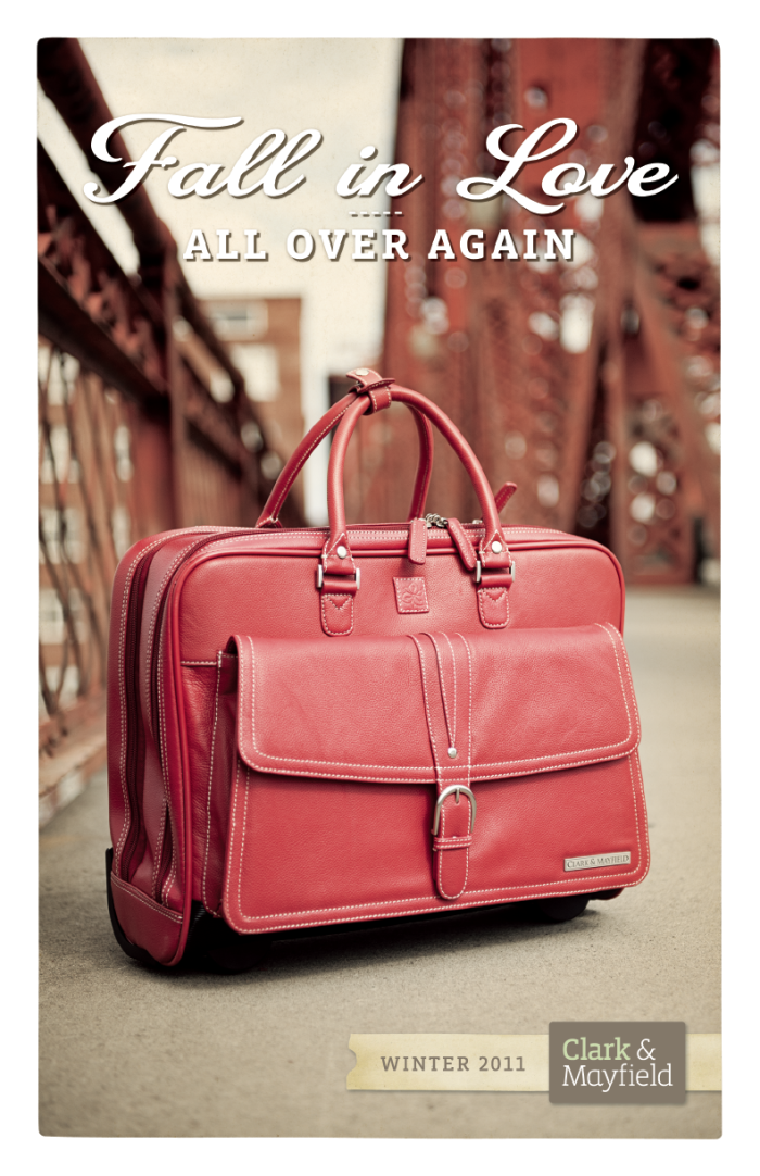
Newsletter for Clark & Mayfield
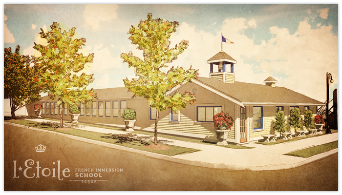
Stylized Rendering Enhancement
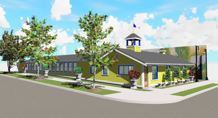
We helped stylize this rendering for L'Etoile's new building in John's Landing. The new building will allow this French Immersion School to add Kindergarten & First Grade in January with plans of opening 2nd-5th grades in the fall of 2012.
BEFORE
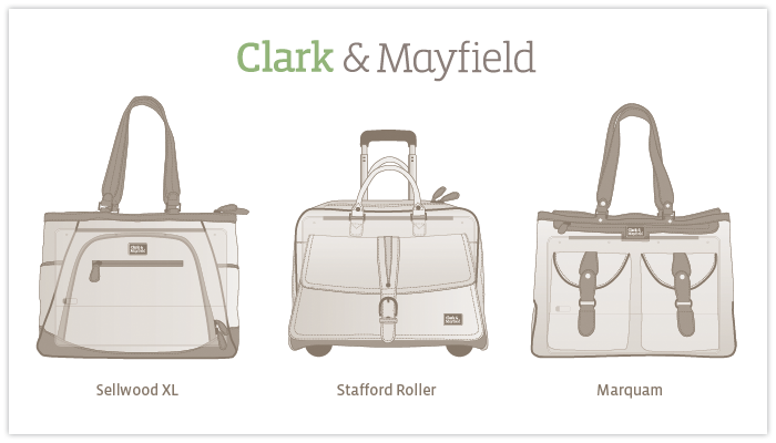
Technical Drawings for Women's Handbags
Created a bunch of technical drawings that will be used on hangtags and on the website to help show off the features and specs of each Clark & Mayfield bag line. Each bag is named after a Portland street or neighborhood.
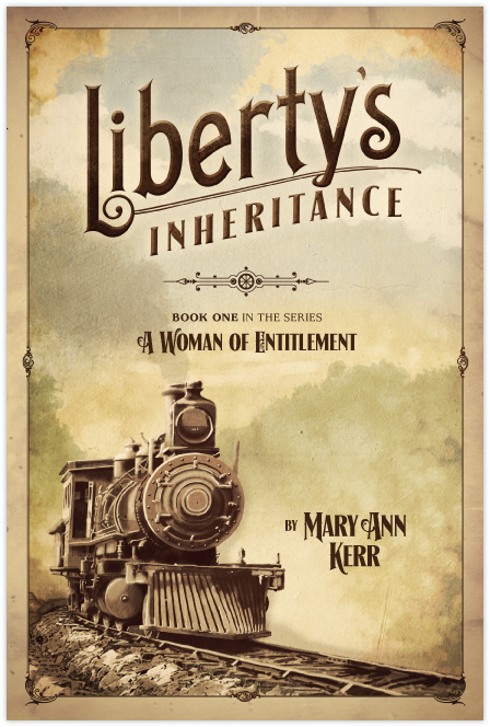
Final Cover for Mary's new Novel
This is the final cover for Mary's new book. It is running ahead of schedule so it may be out in time for Christmas. I'm looking forward to seeing it in print and also looking forward to working on the sequels.
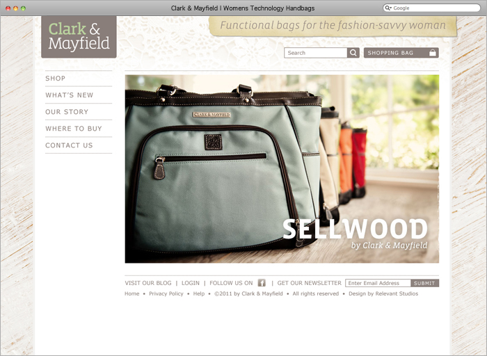
Clark & Mayfield's New Website has launched
The new e-commerce site for Clark & Mayfield has launched thanks to the good people down at CloudQuarry who helped with Magento development.
» See it live at clarkandmayfield.com
» See our Clark & Mayfield Case Study
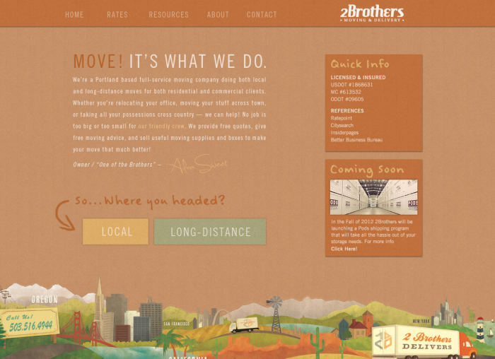
Website Upgrade (in the works)
New website in the works for 2 Brothers Moving. We are helping to evolve this brand as the company has grown (in size, stature, & prowess) and its goals have been refined. We're updating the logo, colors, and repositioning the company to reach a wider demographic while still remaining the leader in its current category. We're excited to see the revitalized brand roll-out over the next few months. More to come on this for sure.
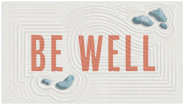
Be Well graphic for Sacred Root
We created an image of a zen garden that will be seen on the homepage of the new Sacred Root website.
New Illustration for Mary's Book
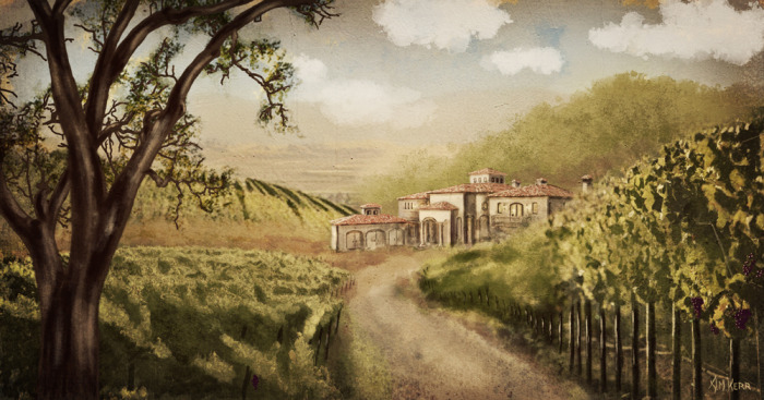
Created a new illustration that will go on the back of the book cover of Mary's new novel - Liberty's Inheritance.
Campaign Graphics for 2 Brothers Moving (in the works)
