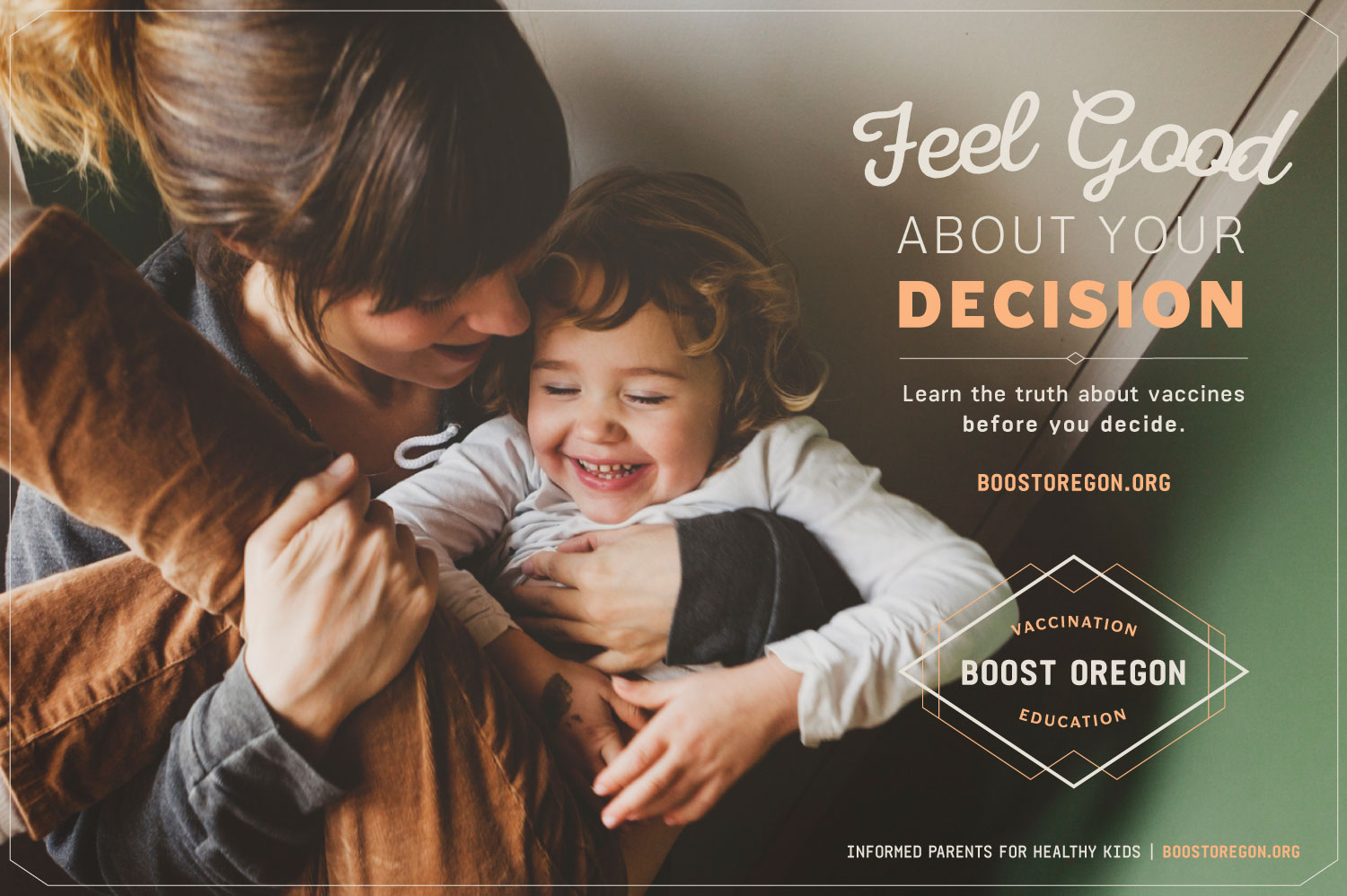
Identity for Boost Oregon
Web Design for People's Food Co-op
New website design for People's Food Co-op in Portland.
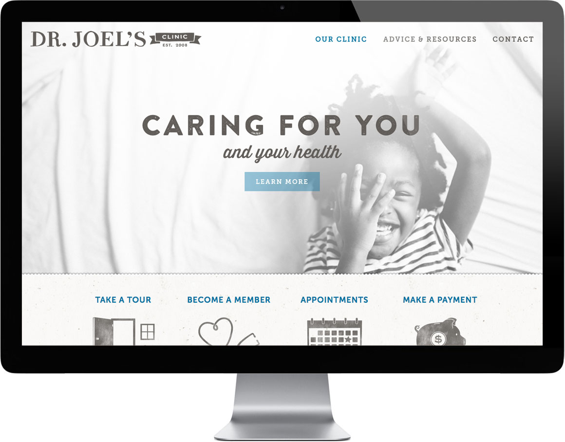
Responsive Website Design for Dr. Joel's Clinic in Portland
Dr. Joel's pediatric clinic is a breath of fresh air representing a holistic yet science-based approach to medicine. We designed and developed an all-new website that really represents Dr Joel and his clinic in a positive and authentic way.
Non-profit logo design for Luke-Dorf
We're helping Luke-Dorf to rebrand their nonprofit that helps people dealing with mental illness in the greater Portland area.
Brand Design Case Study for Gladys Bikes in Portland
Just added a new case study to our portfolio here. Go visit them in the HUB building on N Williams Ave after you grab your French Toast at Tasty & Sons.
Splash Page Web Design for Local Portland Pharmacy
We created a new Identity for Community Compounding Pharmacy and are building out the brand. Here is the splash page that will serve in the interim as we help develop their full website.
Portland Bike Company Branding - Logo and Identity
We're helping to brand a new upstart bike company with a focus on women's bicycles and accessories that will serve the Portland community soon. Below is the logo and some additional identity assets that we've created so far. New website to come soon...
Branding & Identity Design for Montessori NW
New identity in the works for this Portland based Montessori center that trains Montessori teachers, partners with Montessori professionals, and helps educate the community about Montessori. More to come soon...
What if... Meadows Needs a New Lift?
Every once in a while we choose an organization we like and experiment with their identity on pure speculation to see how a new logo can change an image and make a first impression. A logo plays an important role in building an organization's reputation — Its like meeting someone for the first time. Surprisingly an organization's relationship with its customers is not unlike a personal relationship — a first impression can go a long way.
This year we had no other choice but to do a logo update for Mt Hood Meadows, as a large billboard was posted right outside of our office window. We had to take it upon ourselves to see if we had anything to offer this Oregon mainstay.
The first step (since we didn't have any client goals) was to create some. We wanted the Ski Resort to be different than its competitors (this one was obvious); We wanted it to appeal to a wide audience (from family sledders to young snowboarders); And we also wanted it to look like a mountain ski resort (and not a giant fish trying to eat the sun).
To make things more interesting we decided to add some limitations.
1) It needed to be a logo update (not a new logo or concept).
2) It needed to be made of 2 colors (instead of four).
3) It needed to be a retail brand. We wanted to create a platform for selling merchandise.
Here is the before and after...
The result was a solid identity with lots of personality and lots of potential for building a brand that is unique, friendly, and totally sellable. The updated identity is still approachable but would make Meadows feel more like a destination — a place where memories are born; A place where fun meets daring; A place where you can pick up a cool looking t-shirt and actually wear it in public.
It may not necessarily be epic, but a logo does't need to be epic. It just needs to identify the organization, be authentic, flexible, timeless, memorable, and the foundation of a system that communicates the value of the organization it represents.
Let us know what you think (be it good or be it bad) by adding a comment below.
Photo/Video shoot at Operation Nightwatch
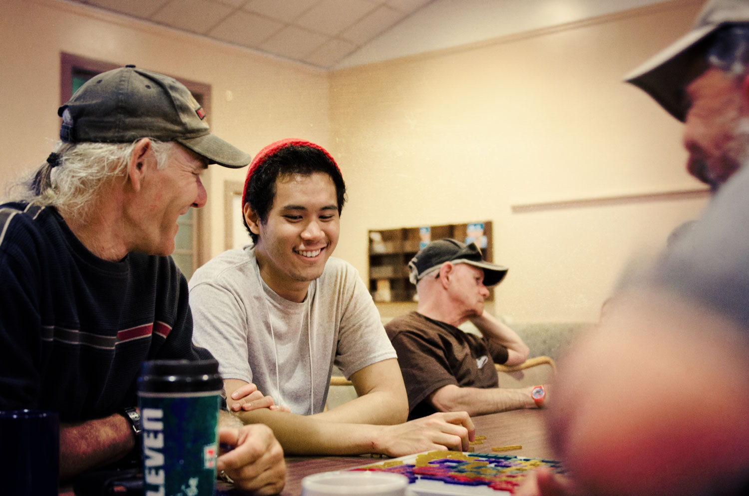
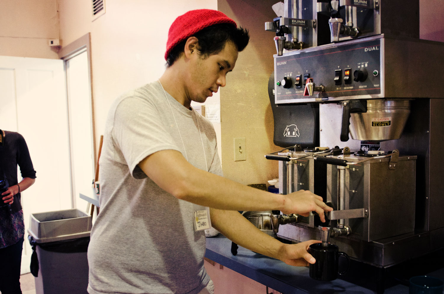
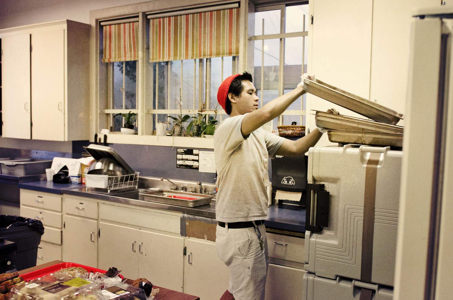
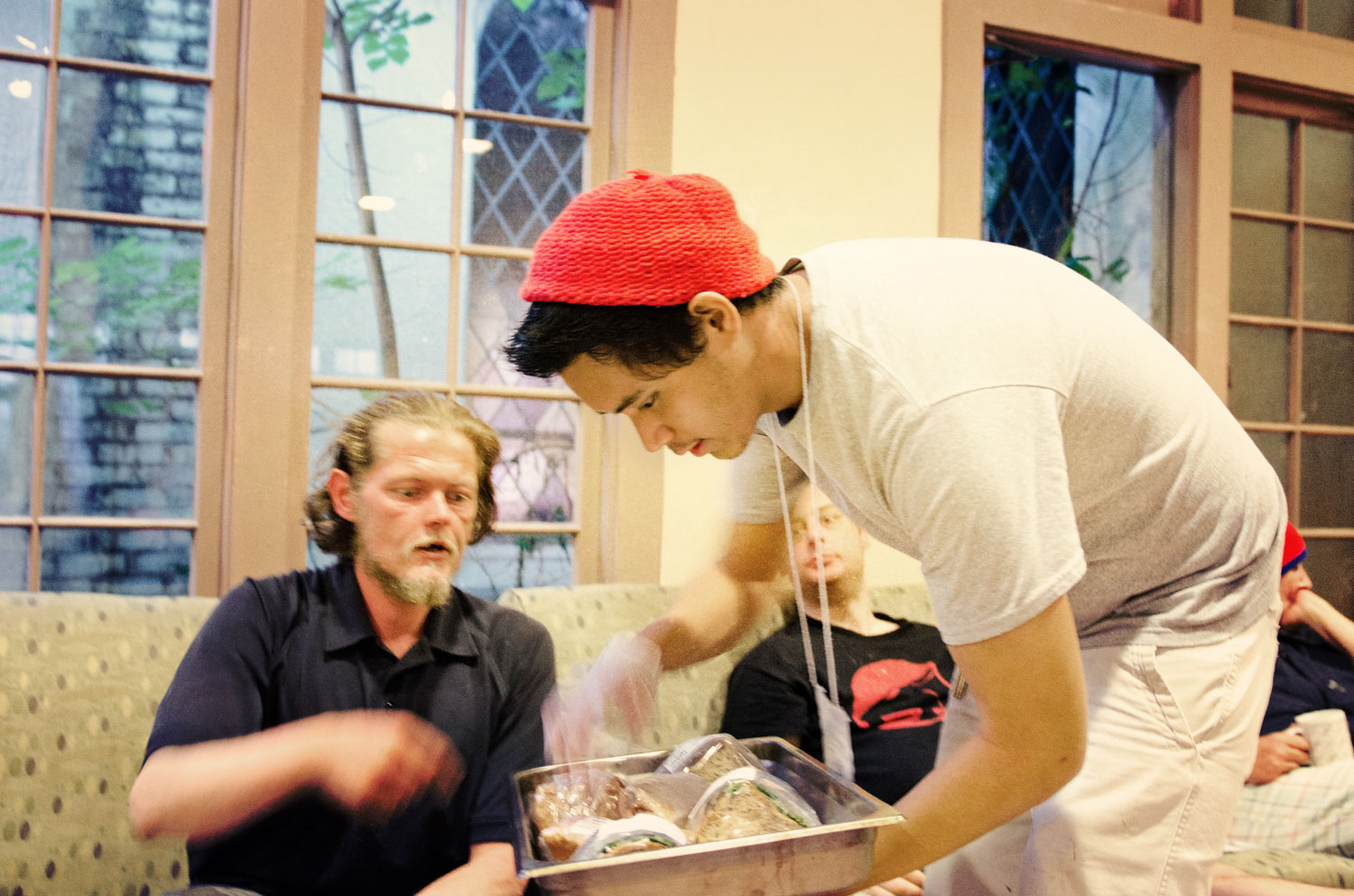
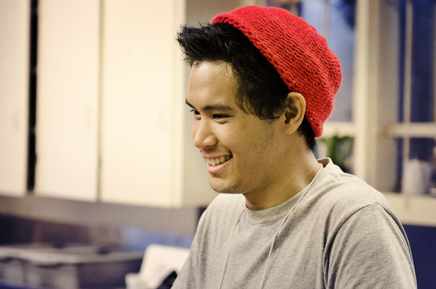
We shot video over the weekend to help develop rich content for an upcoming website launch for JVC Northwest. We spent some time with one of their volunteers at his service project in downtown Portland. He helps at a hospitality outreach called Operation Nightwatch and it is a really cool project. Below are some stills we shot between filming...

New identity for The Herb Shoppe
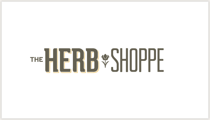
We're working with The Herb Shoppe to redesign their identity and packaging. Below is the core identity that we will we building communication pieces from and that will be the foundation for the new packaging system (which will be coming soon).
The Herb Shoppe has two lovely locations — one in Brooklyn New York and one in Portland Oregon and the identity will appeal to audiences in both locales. Traditional Medicine for Modern Times is the message or positioning statement for the organization and the Identity was designed to be timeless (applicable to both the history and future of natural medicine).
And here is the design for the new business cards. We will take some pictures of the cards and the rest of the stationery set as soon as they are printed.


