SOLD OUT - "Portland Ore." T-shirt design now available in 5 colors. Printed on premium American Apparel shirts.
Portland Neighborhood Shirts - Sold Out


SOLD OUT - Portland Neighborhood T-Shirt designs are for sale on our store.
New case study added for Urban Nest Realty

We just added a new case study to our portfolio for Urban Nest Realty!
Packaging design for The Jasmine Pearl featured on "Lovely Package"
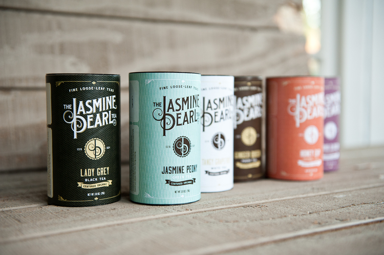
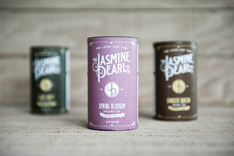
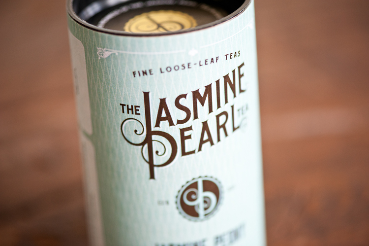
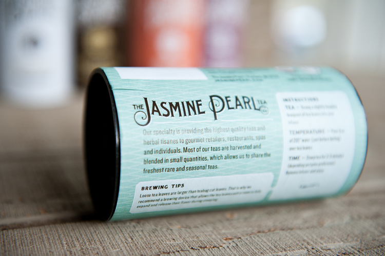
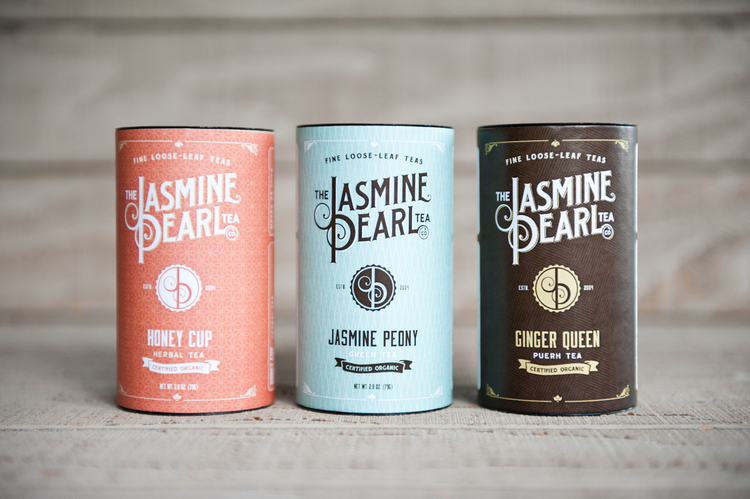
Thanks to Lovely Package for featuring our design work for The Jasmine Pearl Tea Company's new tea packaging.
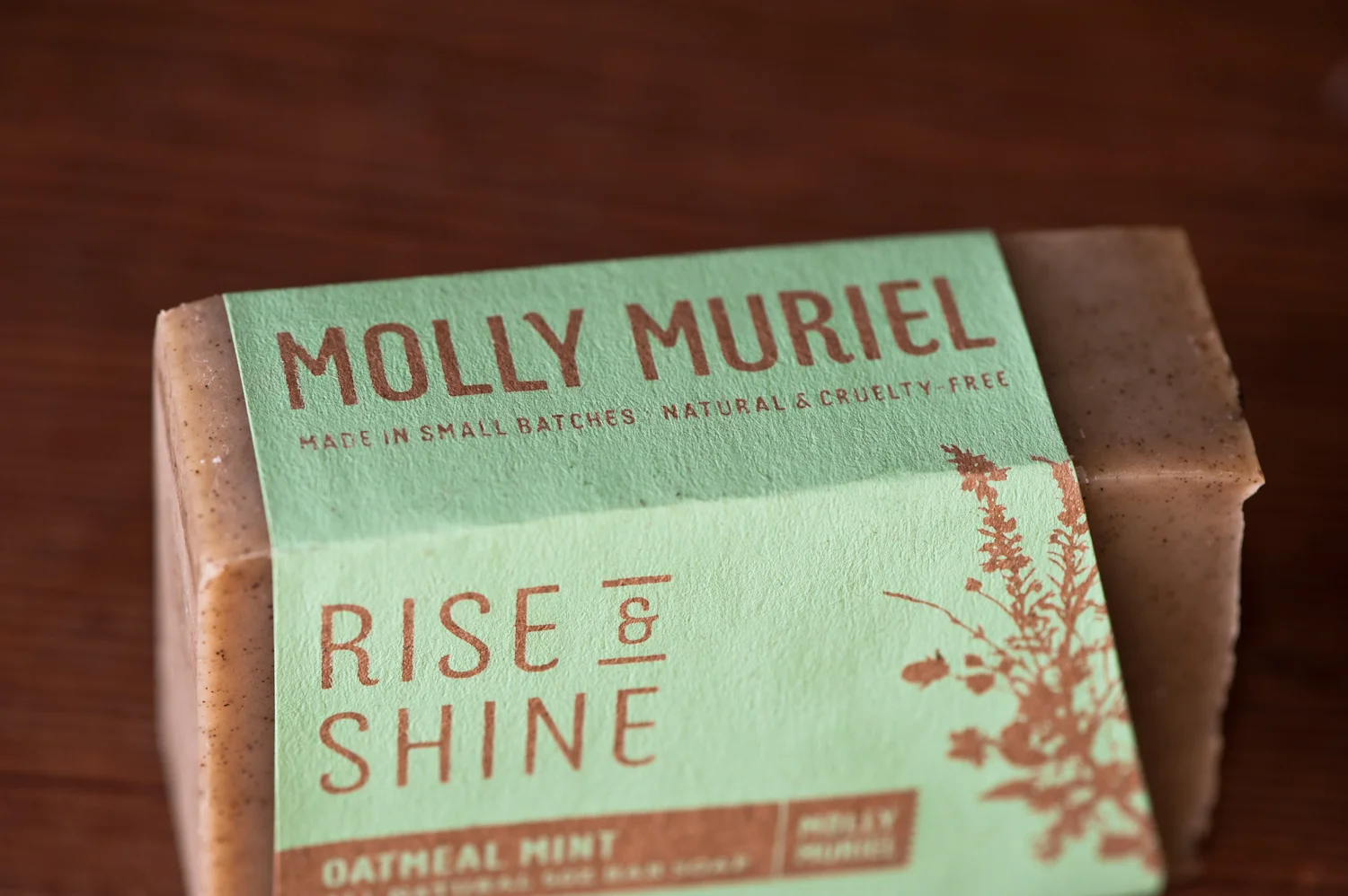
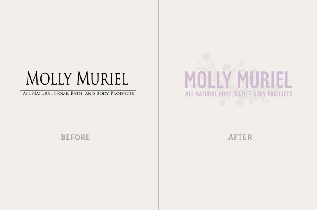
Packaging Design for Molly Muriel on The Dieline
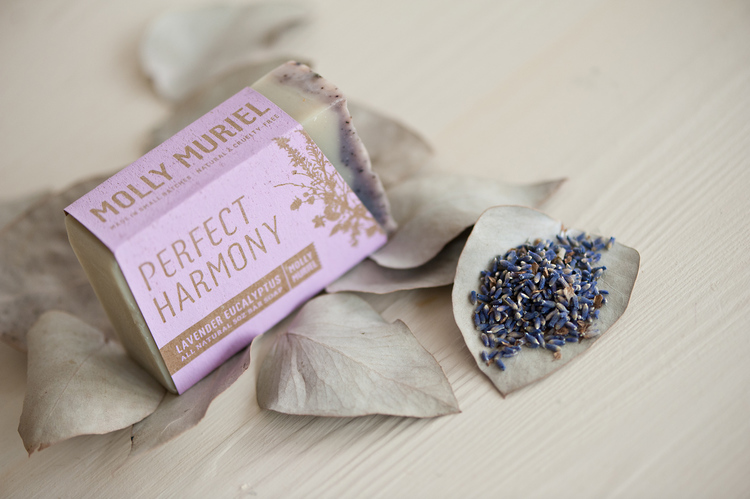
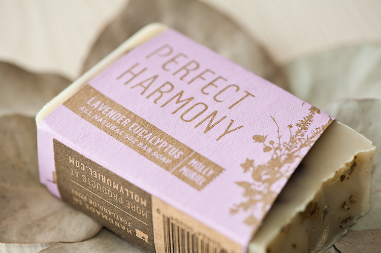
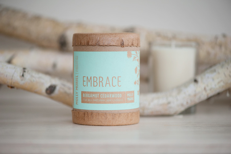
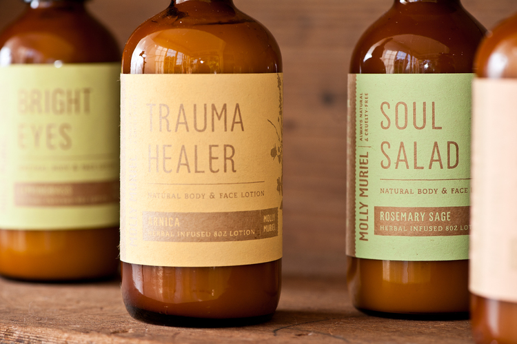
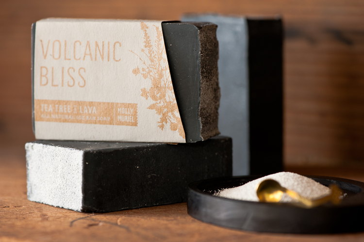
Our packaging design for Molly Muriel's home, bath & body products was just featured on The Dieline (One of our favorite packaging design websites).
What is Identity-driven Branding?
We believe that a brand's identity is the most important catalyst for potential growth and success and a powerful identity starts with a strong logo.
A logo is a word-mark or symbol (or combination of the two) that serves to represent a brand. A good logo will help to provide recognizability and consistency for a brand and is the key-stone of any successful Identity System.
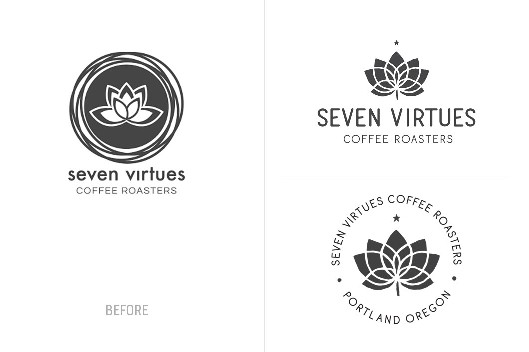
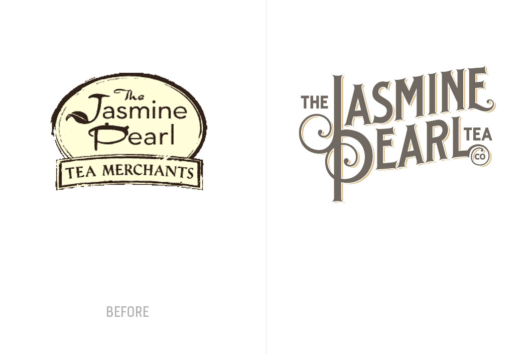
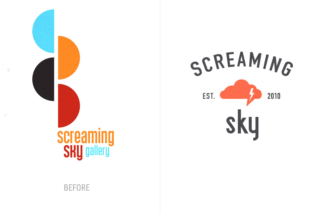
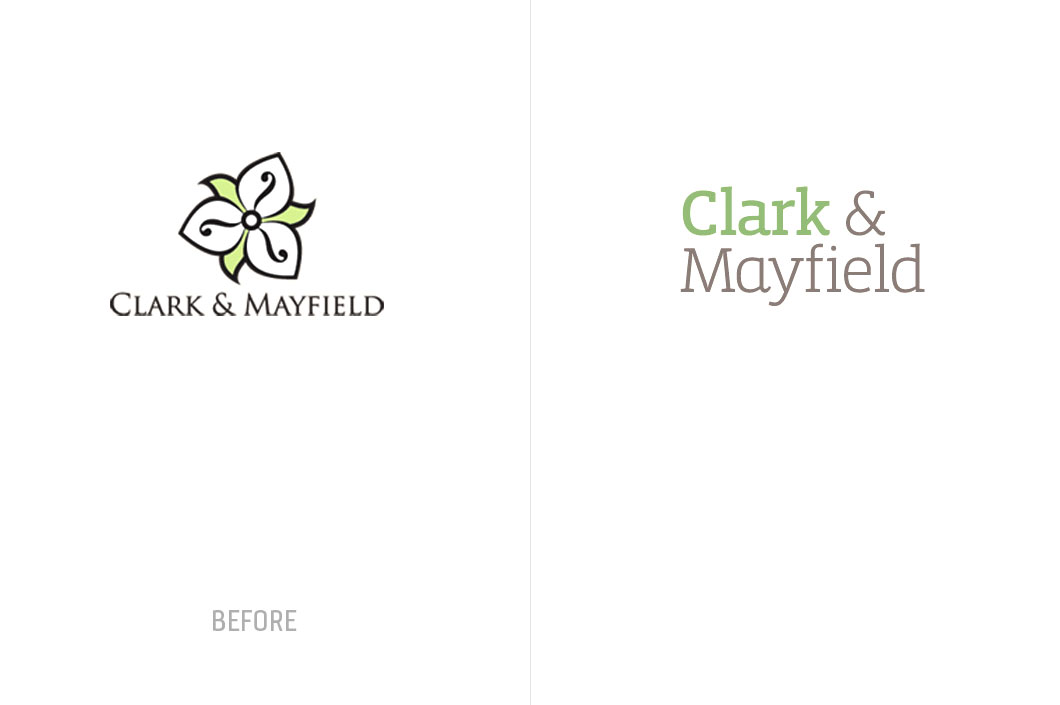
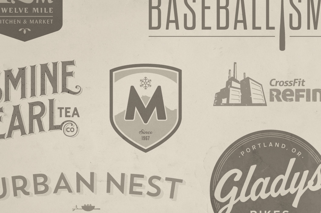
When we engage a potential brand (company, product, service, or idea) to work with, we always assess the logo and identity first. Above are some recent logo updates and overhauls that we developed before letting the client invest further in their brand.
What makes a good logo?
A solid logo usually embodies a few key qualities:
1) It should identify, not explain — a logo should not literally describe the business; it's more of a "signpost" that identifies the company and reflects its attitudes and values. A logo should give direction and attitude, while the product or service provided will inform the meaning.
2) It should be seductive — Logos are most successful when they are simple and dynamic. They need to work in a wide range of media (print, web, on the wall, etc) and hold up in all applications that will make an impression and draw the viewer in.
3) It should pose a question — This goes hand in hand with the first 2: If a viewer is given all the facts there is little reason for him to process the information or delve in deeper. Alternatively, if the viewer is presented with a design that poses a question they will be drawn in to discover more.
4) It should be memorable — Humans see shape, color, and then put what they see within the context of time. After that, humans apply meaning to what they have just taken in or experienced. So a unique design or shape along with color helps to create a memorable logo or identity.
5) It should be timeless — We want to make sure that any logo is designed for longevity. Since humans put a timeline context to everything, the logo needs to stand the test of time as much as possible. We look at our design to see if they would have worked in the past, if it works today, and if it should work in the future. Times do change and though we do our best, a logo should be reassessed for longevity every five years or so. Sometimes a little update or typography change is all that's needed to bring it up to date.
6) It should be the foundation of a system — A logo is only the first impression. It needs to work in a system. An Identity System is a kit of parts or predefined set of brand assets that usually include the logo, typography, color palettes, messaging, and additional branded imagery (photos, icons, illustrations, patterns, textures, etc). These elements combine to form an overall look and feel for a brand.
7) It should be flexible — In this day in age the logo needs to be designed for a variety of media including digital, print, on products, and within environments. We design logos that work in multiple color formats and orientations (vertical vs horizontal applications) so that the core components of the identity are very flexible.
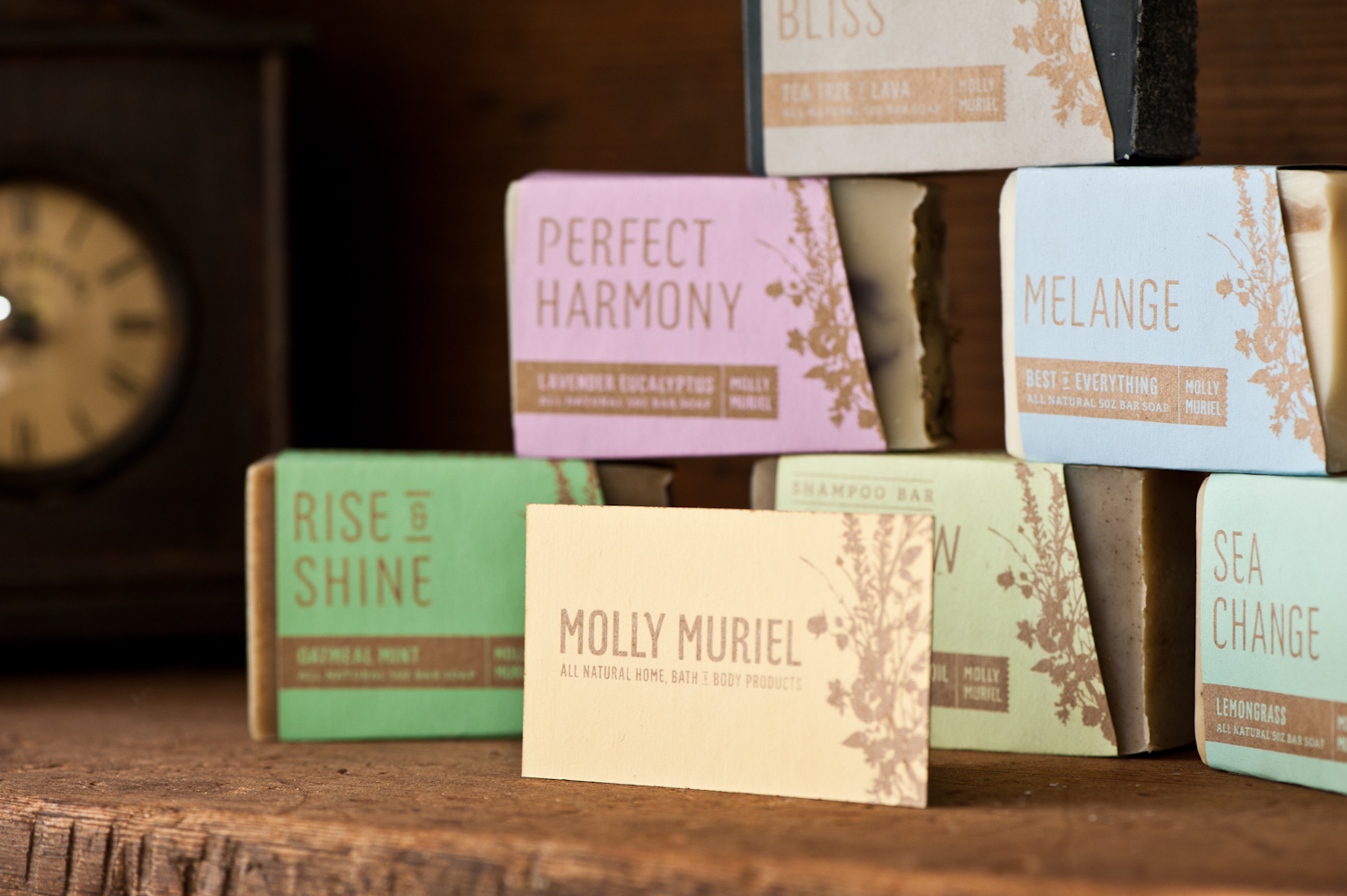
A shout-out from the owner of Molly Muriel

Excerpt from an article on Urban Craft Uprising...
-----
What’s something you’ve learned through running your business in the past 12 months?

"The biggest lesson I’ve learned in the last year is the power of packaging/branding. I started working with a branding company, Relevant Studios in Portland, and within the last year my business has almost doubled. I can’t say enough about the power of getting the point of your product across to the customer through a clear and professional package. It may take the right ‘look’ to sell a product, but once the customer tries it, if it’s good, they’ll be a customer for life. And it all starts with the right label."
-----
Full Story Here: www.urbancraftuprising.com/molly-muriel/
See their Case Study Here
Brand Design Case Study for Gladys Bikes in Portland

Just added a new case study to our portfolio here. Go visit them in the HUB building on N Williams Ave after you grab your French Toast at Tasty & Sons.
Rainbow Pencils on Kickstarter
Found a cool project on Kickstarter. Pencils made of paper that create a rainbow when sharpened. Simple and smart!
Go buy some and get them before Christmas:

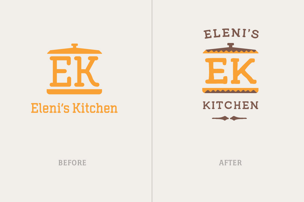
New Case Study - Eleni's Kitchen (Ethiopian Food)
Just added a new case study for Eleni's Kitchen which includes identity design, food photography, packaging, website development, and a farmer's market booth design.

Added Packaging Case Study for Molly Muriel
Since the new packaging for Molly Muriel hit the shelves in New Seasons, sales have nearly doubled. The all new packaging showcases the qualities of the product and matches the brand characteristics of being natural, handmade, and unique.
Learn more in the new case study for Molly Muriel.