
Molly Muriel
CHALLENGE - The owner of Molly Muriel came to us with an amazing product and the need to update her product packaging.
ACTION - After further research and discussion we all agreed that a full redesign including a new identity, new product names, modified containers, and all new packaging designs would set the company up for future success.
RESULTS - We were right. Within a couple months of the new packaging on shelves, Molly Muriel sales had nearly doubled.
A WORD FROM THE CLIENT
Thanks to you and your crew for being so wonderful to me and my company, I'm so excited to see where this will go in the next year, few years, and long term!!! I now know the power of good branding!
~ BRANDA (Owner)
ACCOLADES
Featured on The Die Line
LINKS
mollymuriel.com
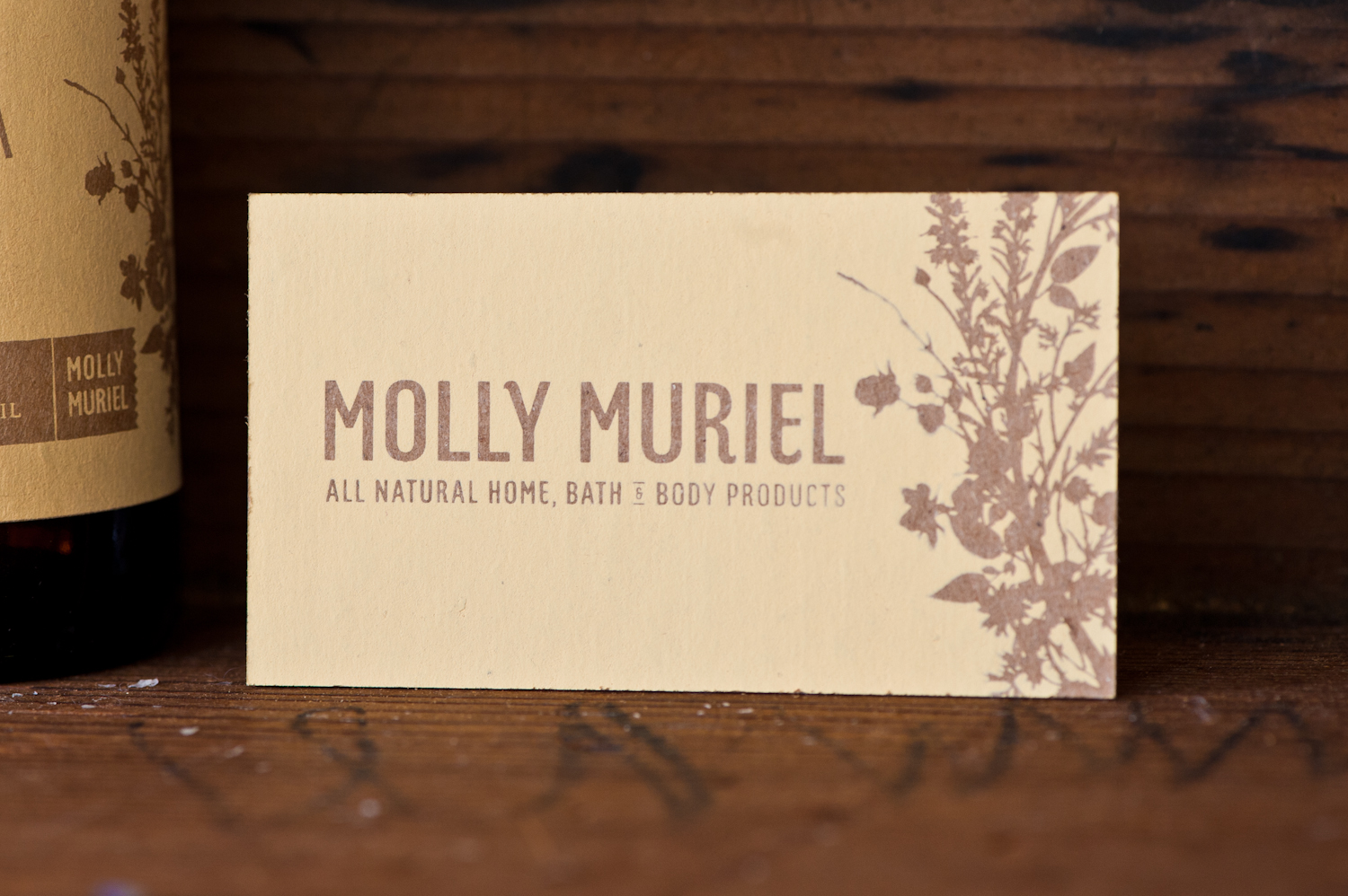
BRAND IDENTITY - Visual Assets
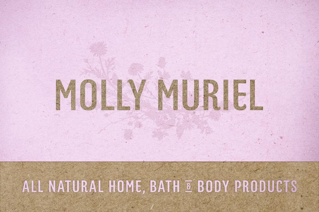
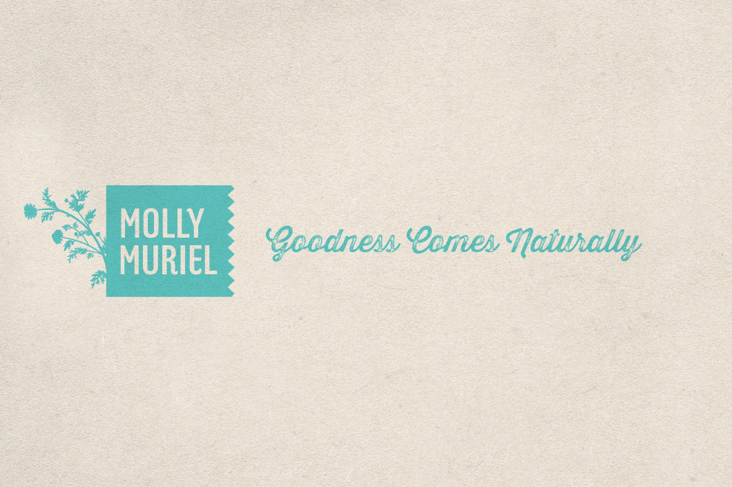
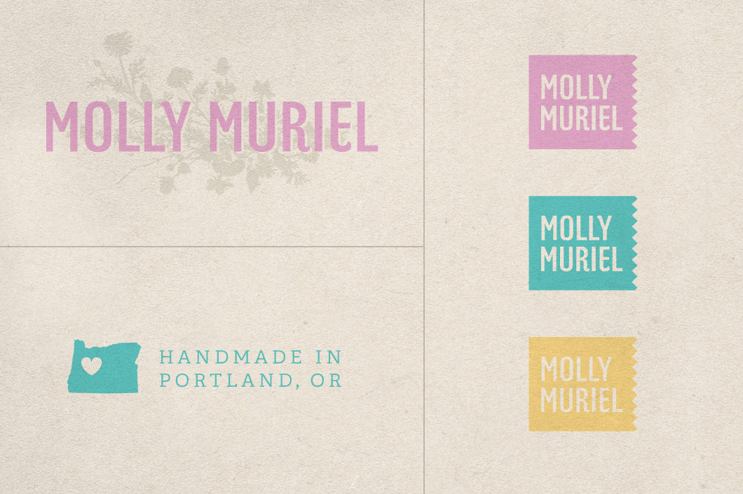
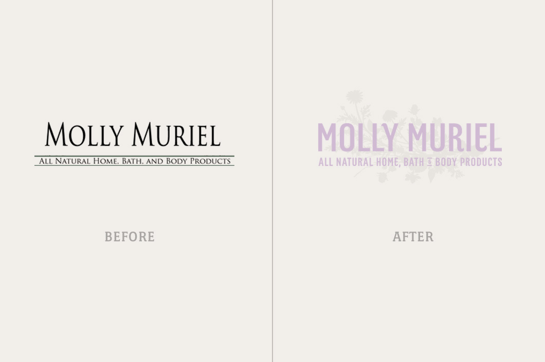
The first step was to make sure that the core identity was in a place that would match up with the company's business goals, desired perception, and quality of product. New typography, verbal messaging, and color palettes were chosen to better represent the company.

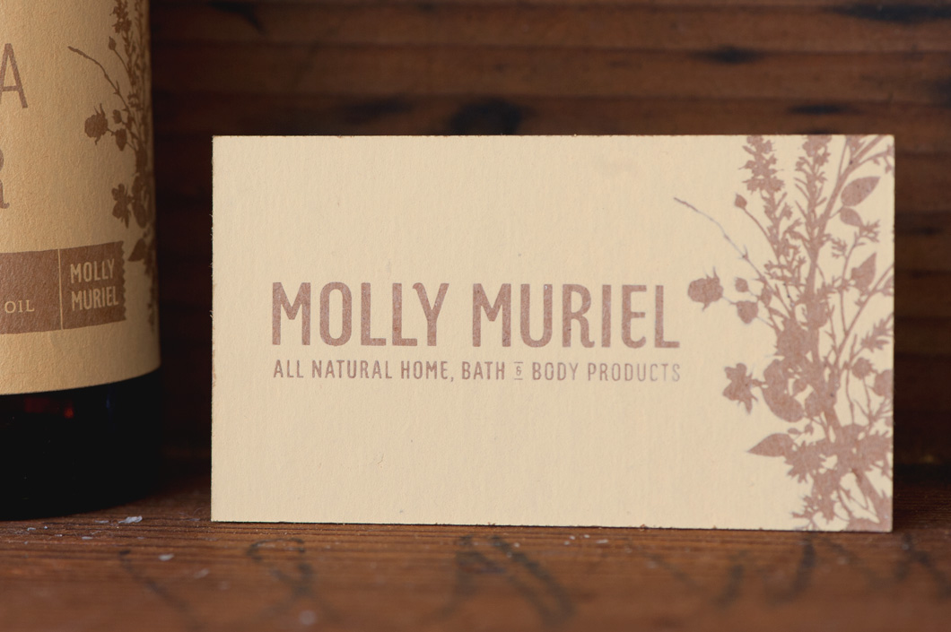
PACKAGING - Home, Bath, & Body Products
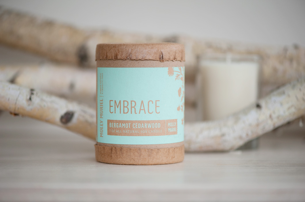
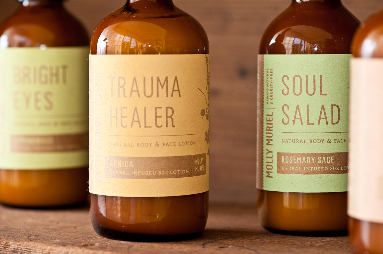
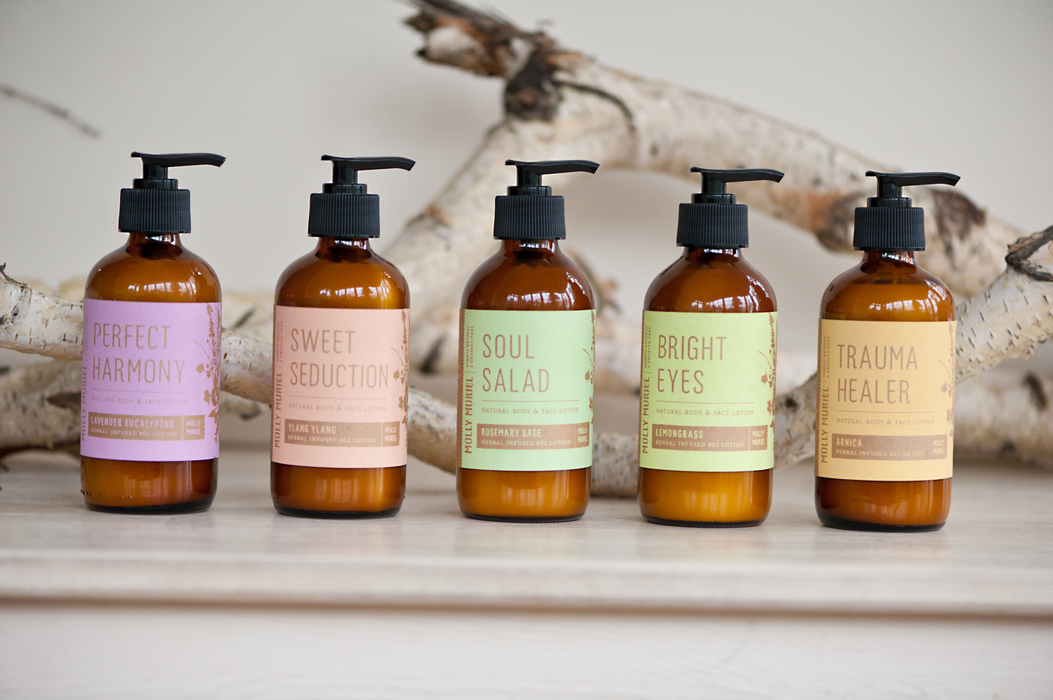
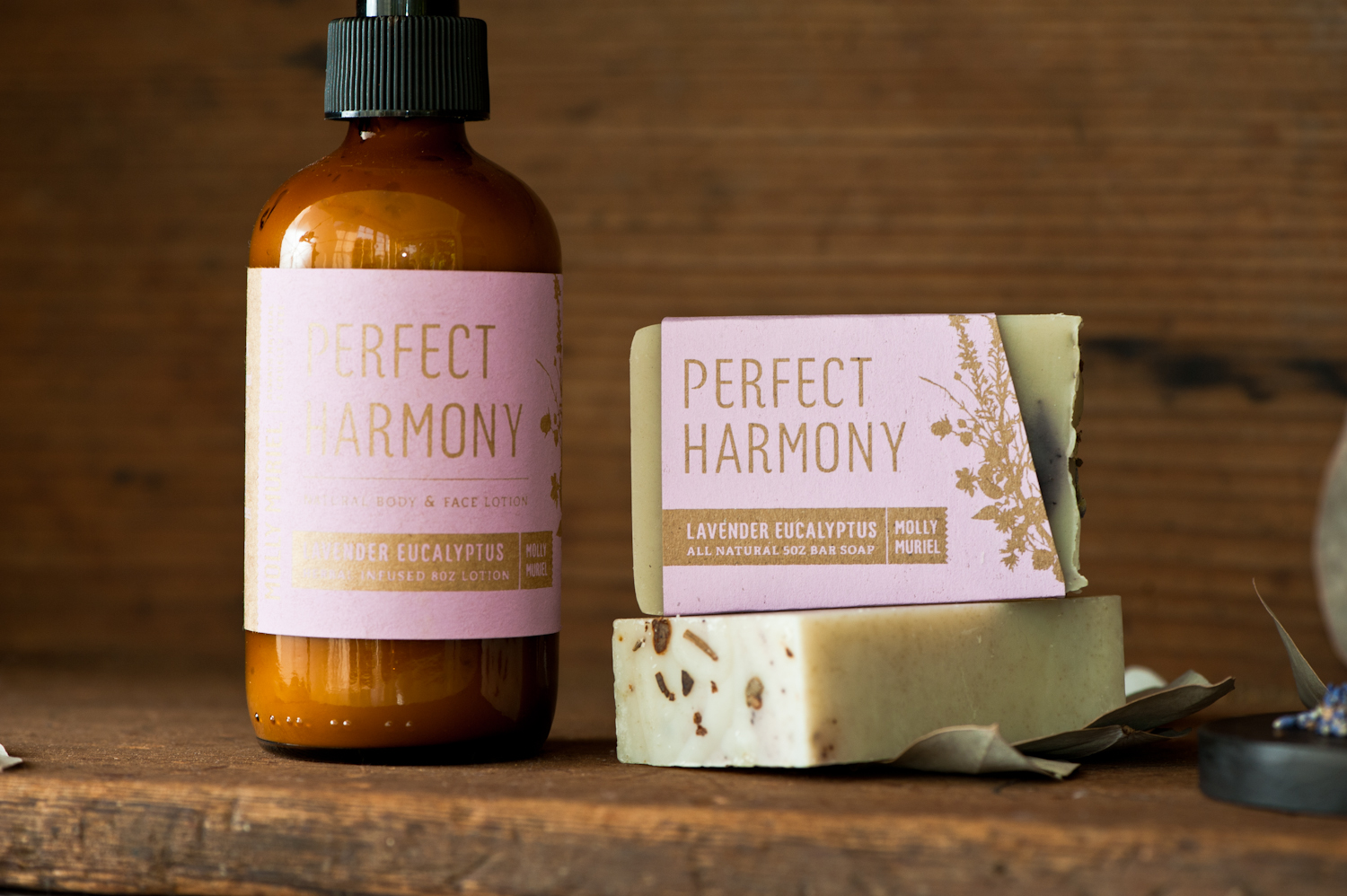
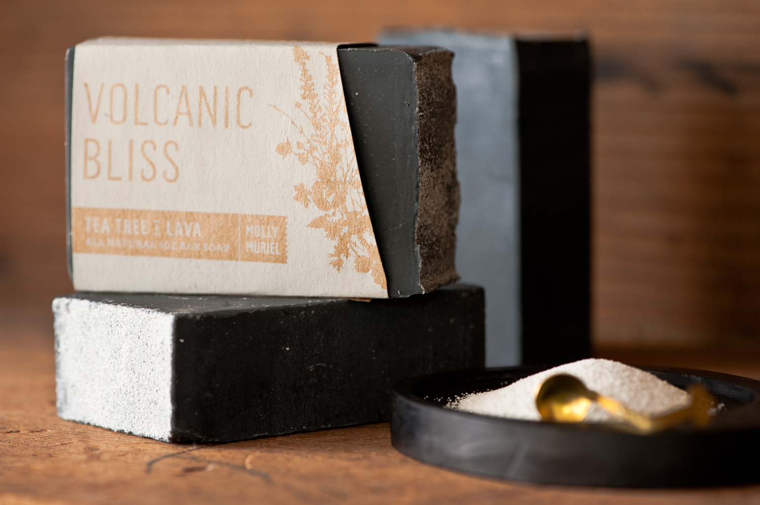

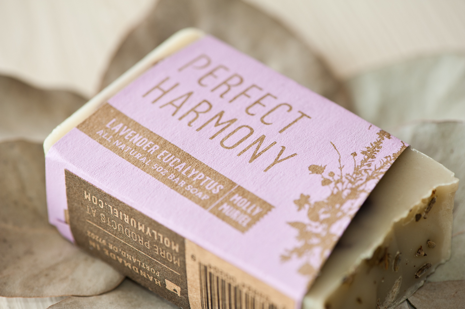
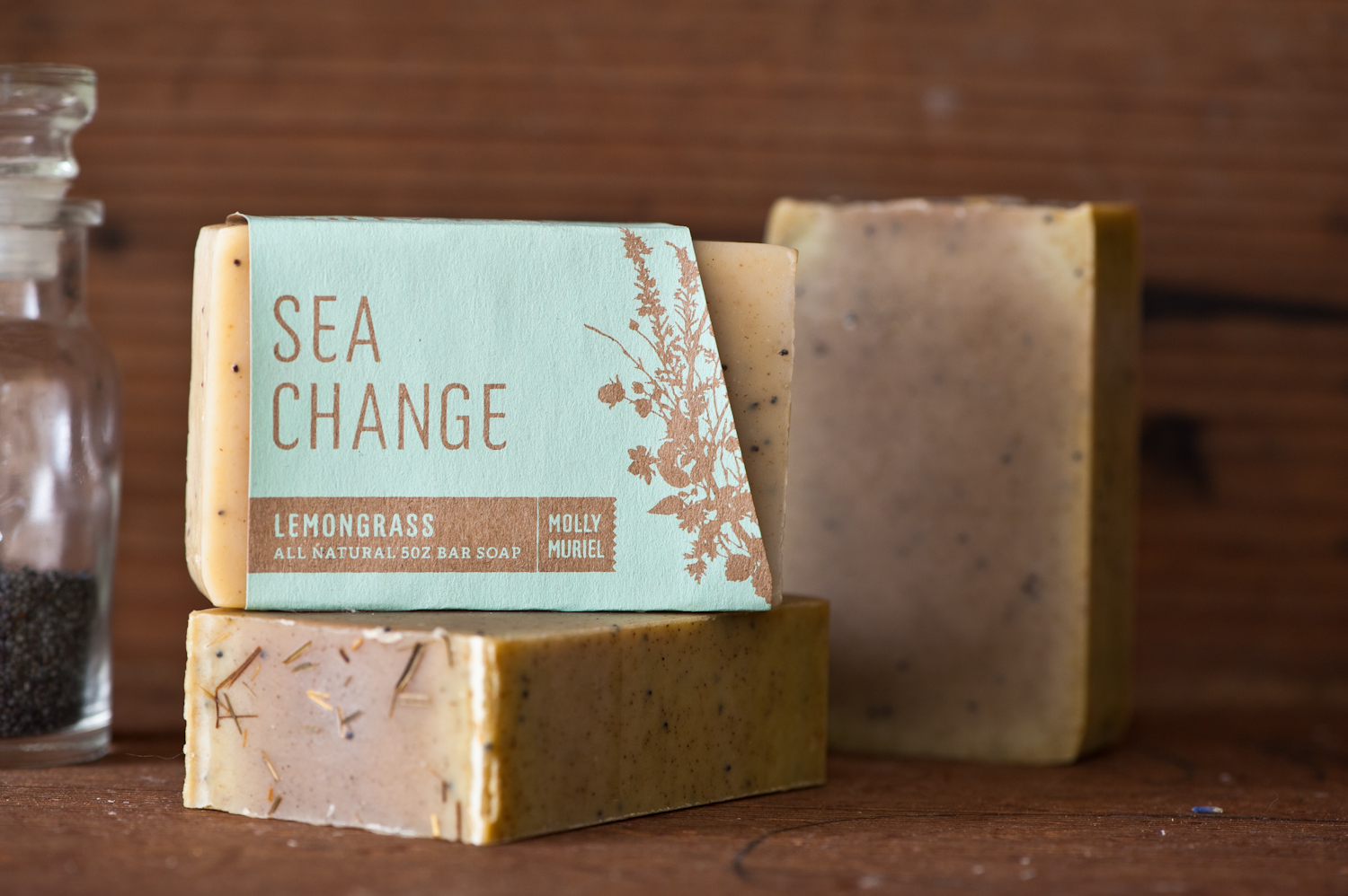
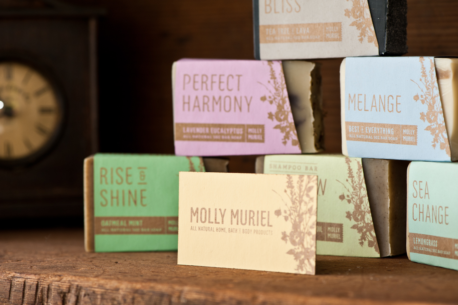
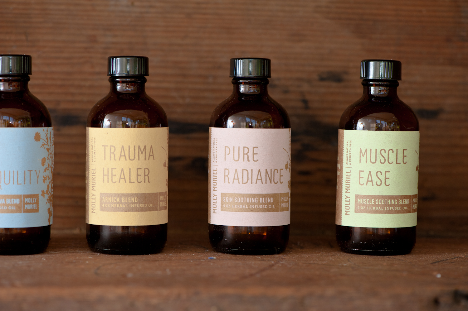
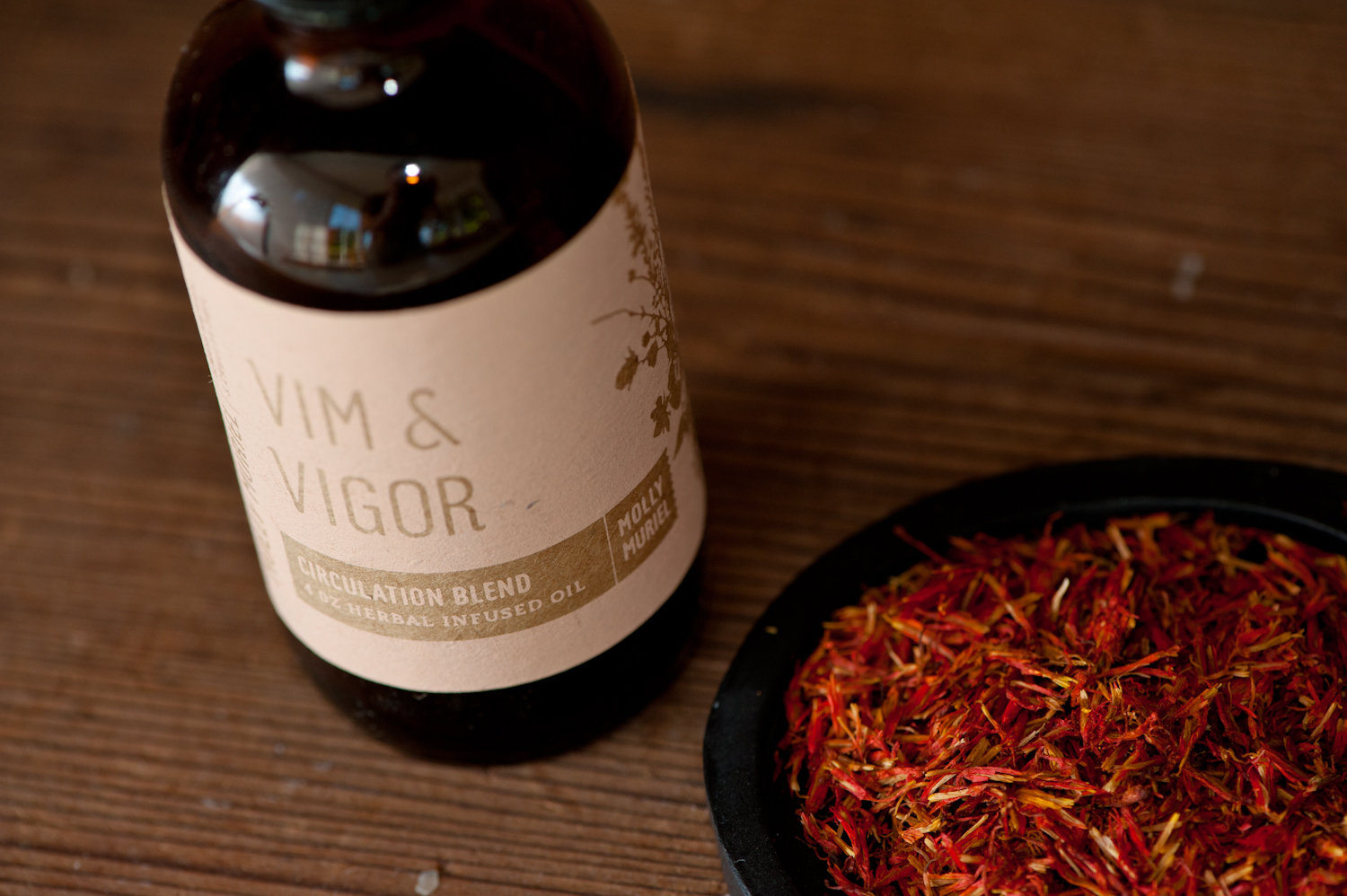
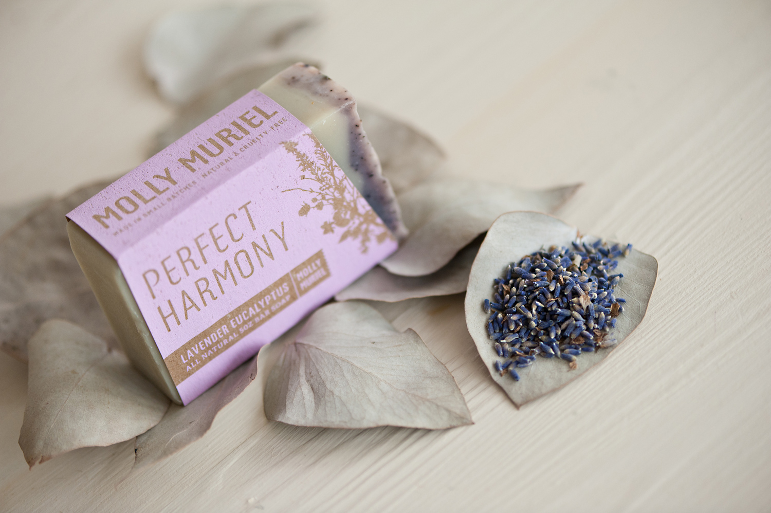
Packaging design for hand made candles, lotions, oils, and soaps made in Portland Oregon. The labels are screen-printed locally by hand on kraft paper.
CONTENT DEVELOPMENT - Verbal Assets
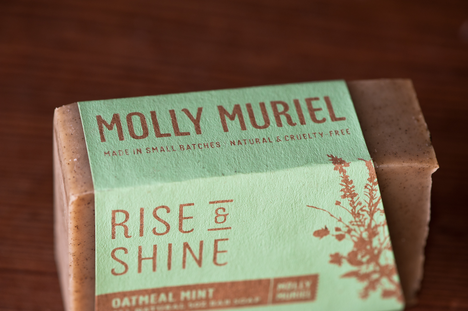
There's power in a name. We worked with the owner to rename all the products in a way that would make the product more compelling and give some emotive quality to each one. Names changed from "Lavender Eucalyptus" to Perfect Harmony, from "Tea Tree & Lava" to Volcanic Bliss, from "Oatmeal Mint" to Rise & Shine, and so on. Then we used the previous names as descriptors below each title.


