Screaming Sky
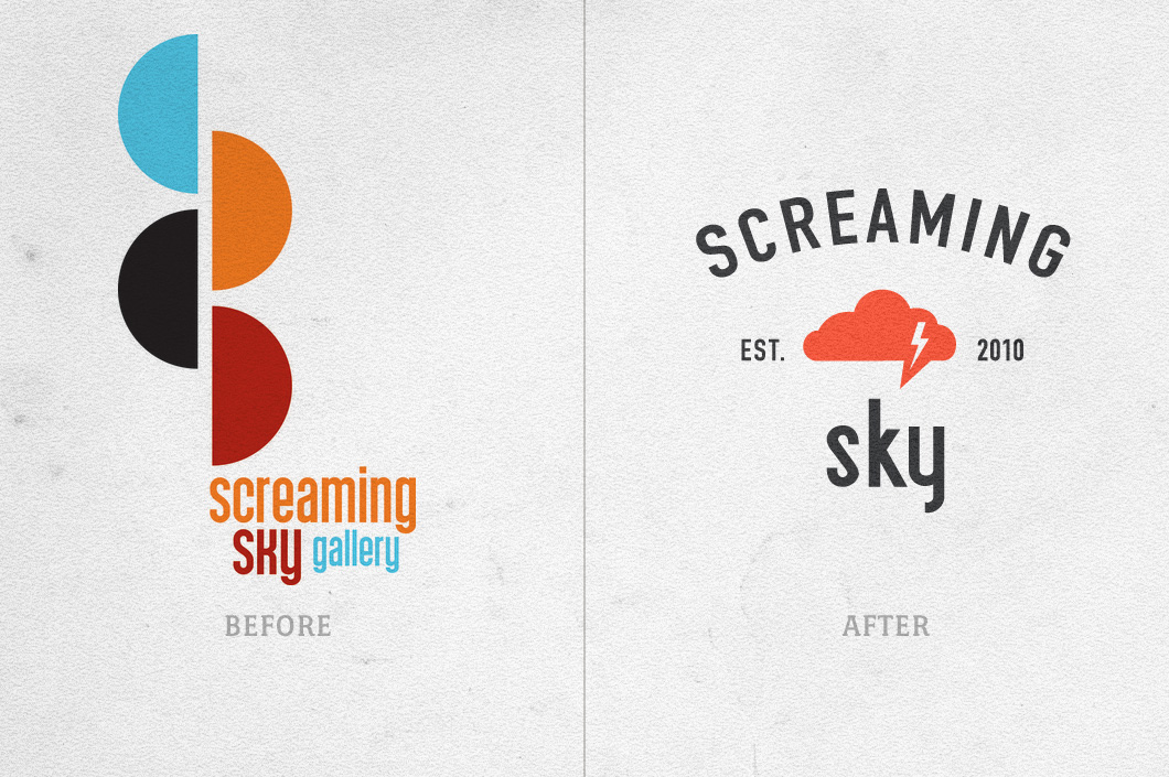
CHALLENGE - Screaming Sky Gallery believed to be losing potential buyers due to the negative stereotypes around "Art Gallery's." The Alberta Street mainstay needed help to rebrand their store which would coincide with moving their location further up Alberta Street (next to Salt & Straw).
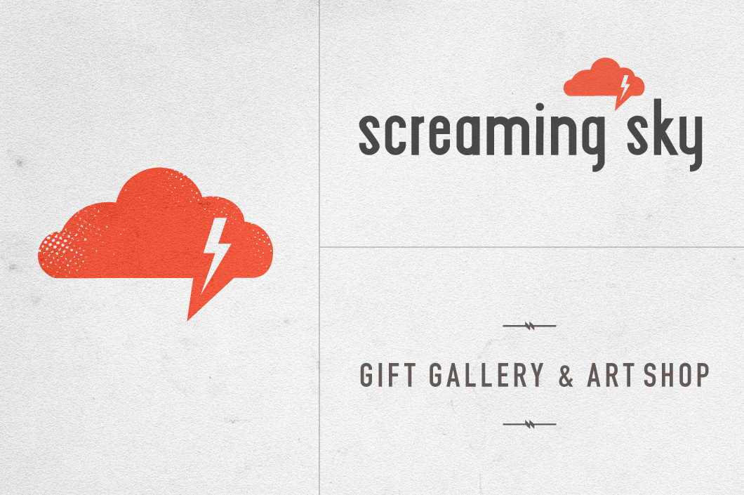
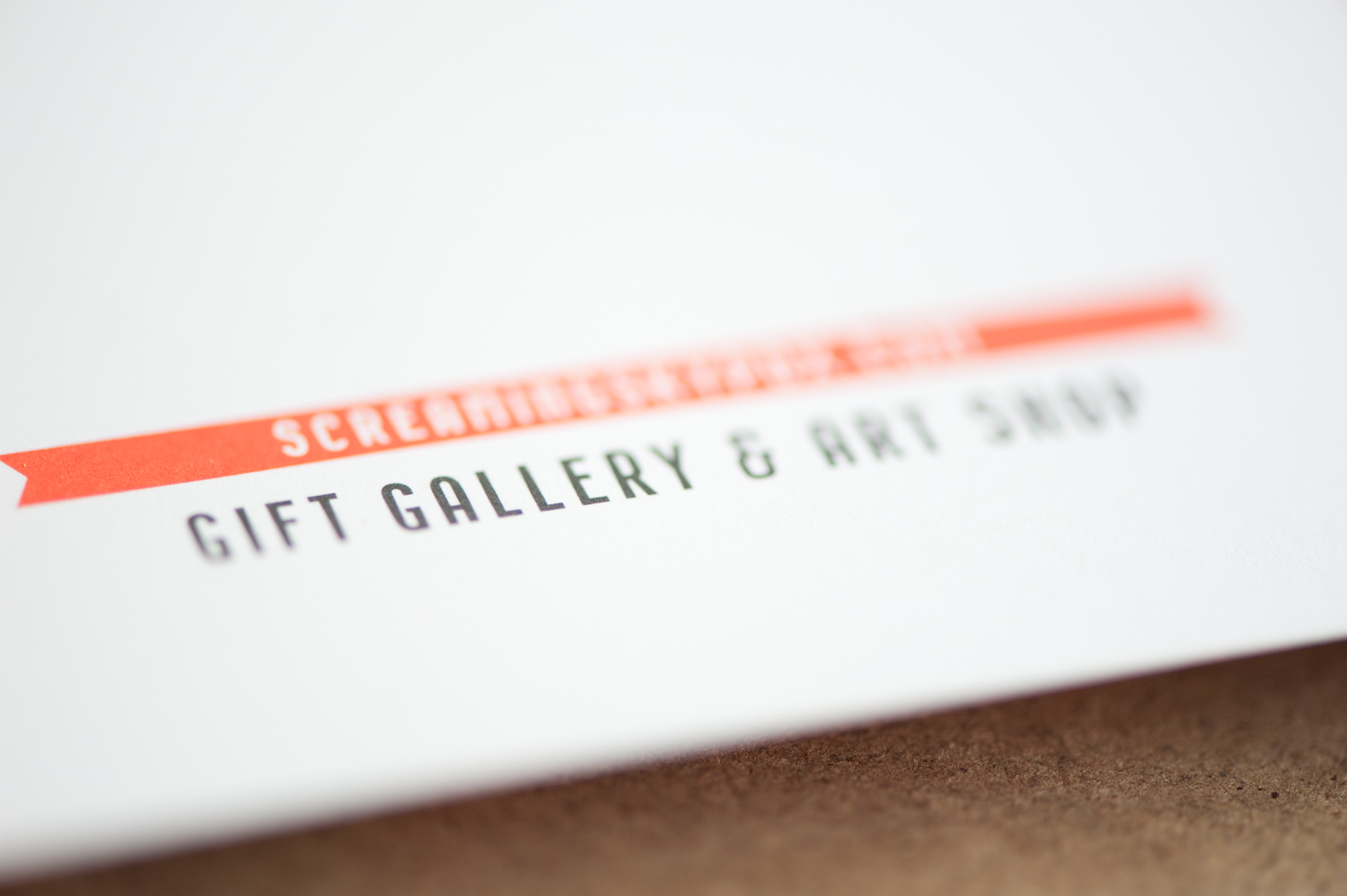
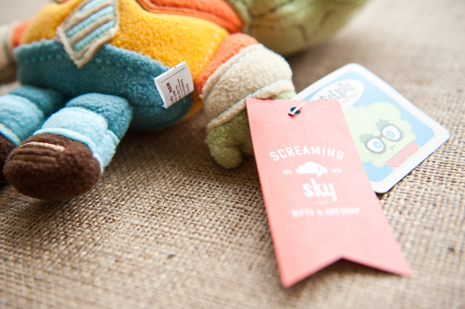
ACTION - We started by consulting on the descriptor of "Gallery" and by helping the company to reposition themselves (both physically and in the minds of their audiences) through visual and verbal identity branding. The new look and descriptor of "Gift Gallery & Art Shop" will help them avoid negative stereotypes while reaching out to new audiences.
RESULTS - The result is an identity that will reach a broader base and more clearly represent the company and its offerings. It is both alternative (for its core creative audience) and inviting to help usher in the general public and provide a platform for growth.
BRAND IDENTITY - Logo Design


BRAND IDENTITY - Color Palette
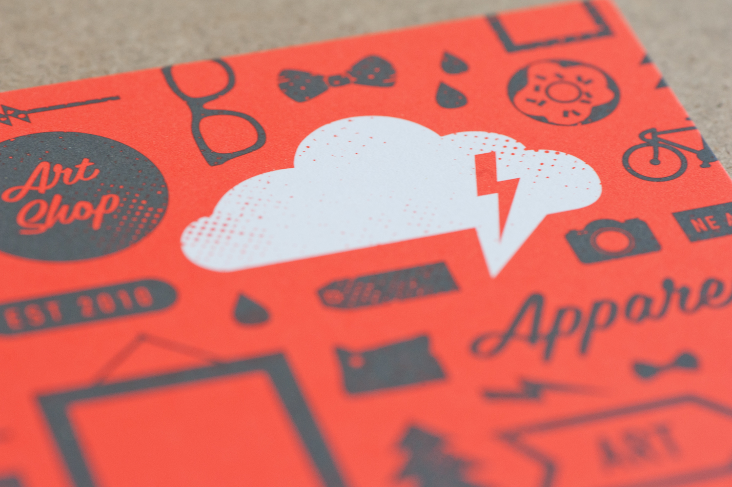
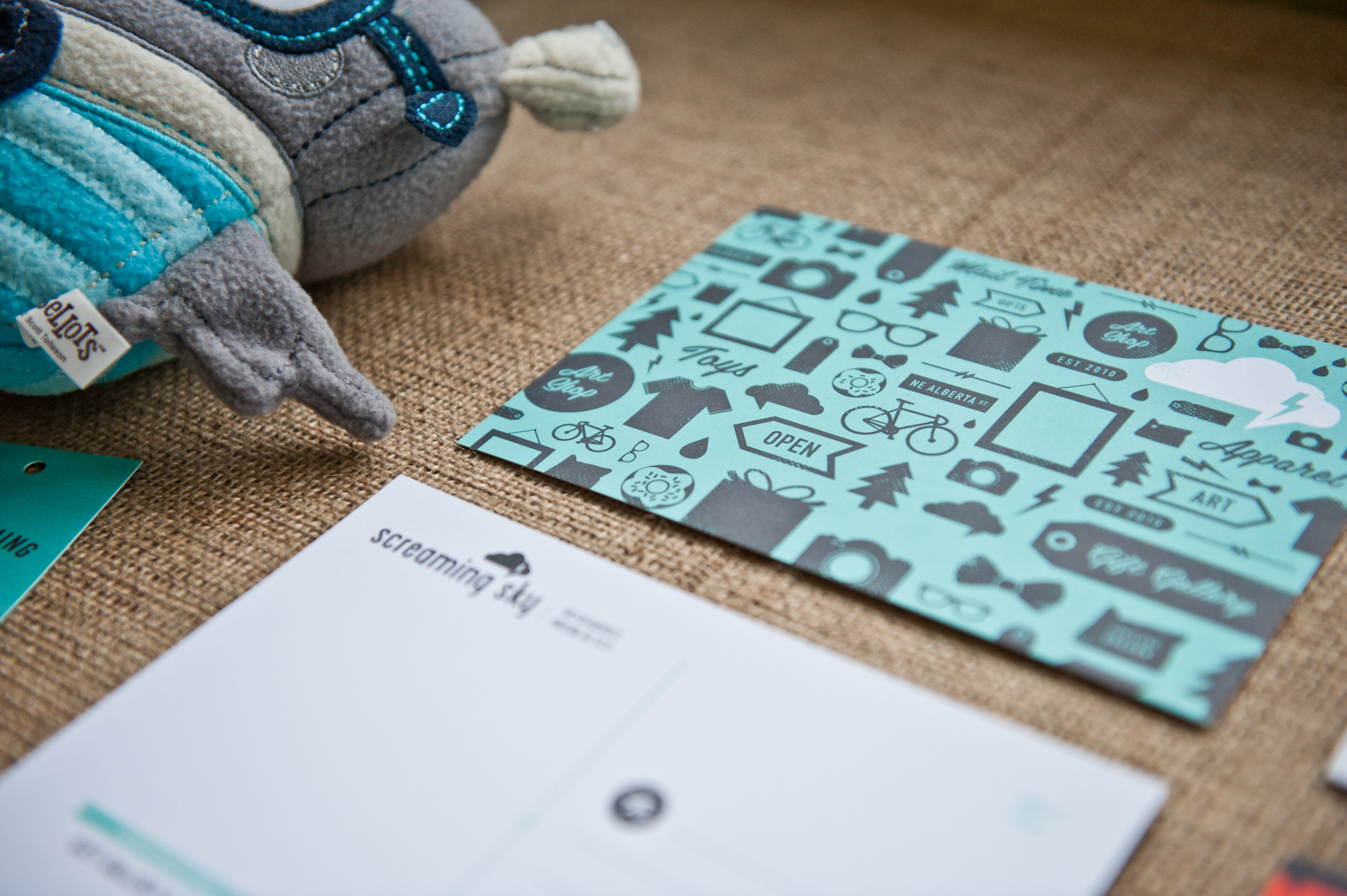
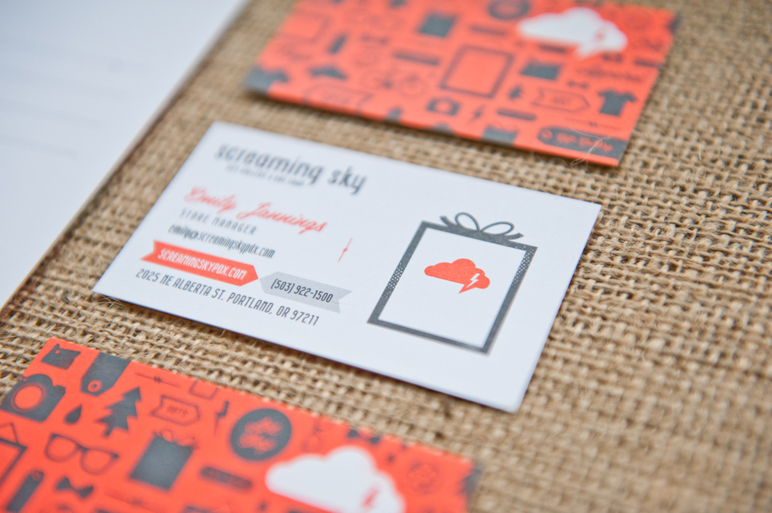
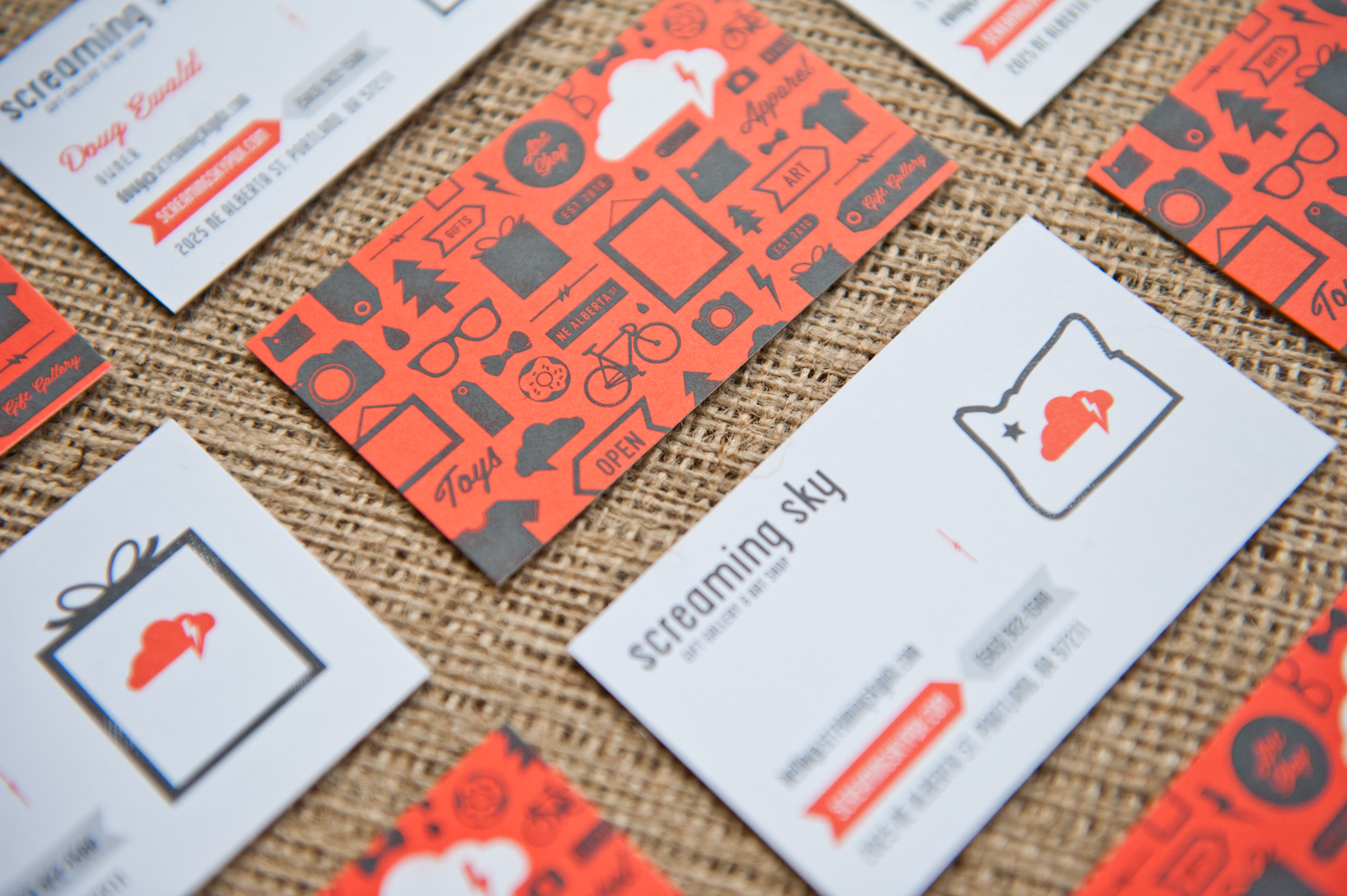
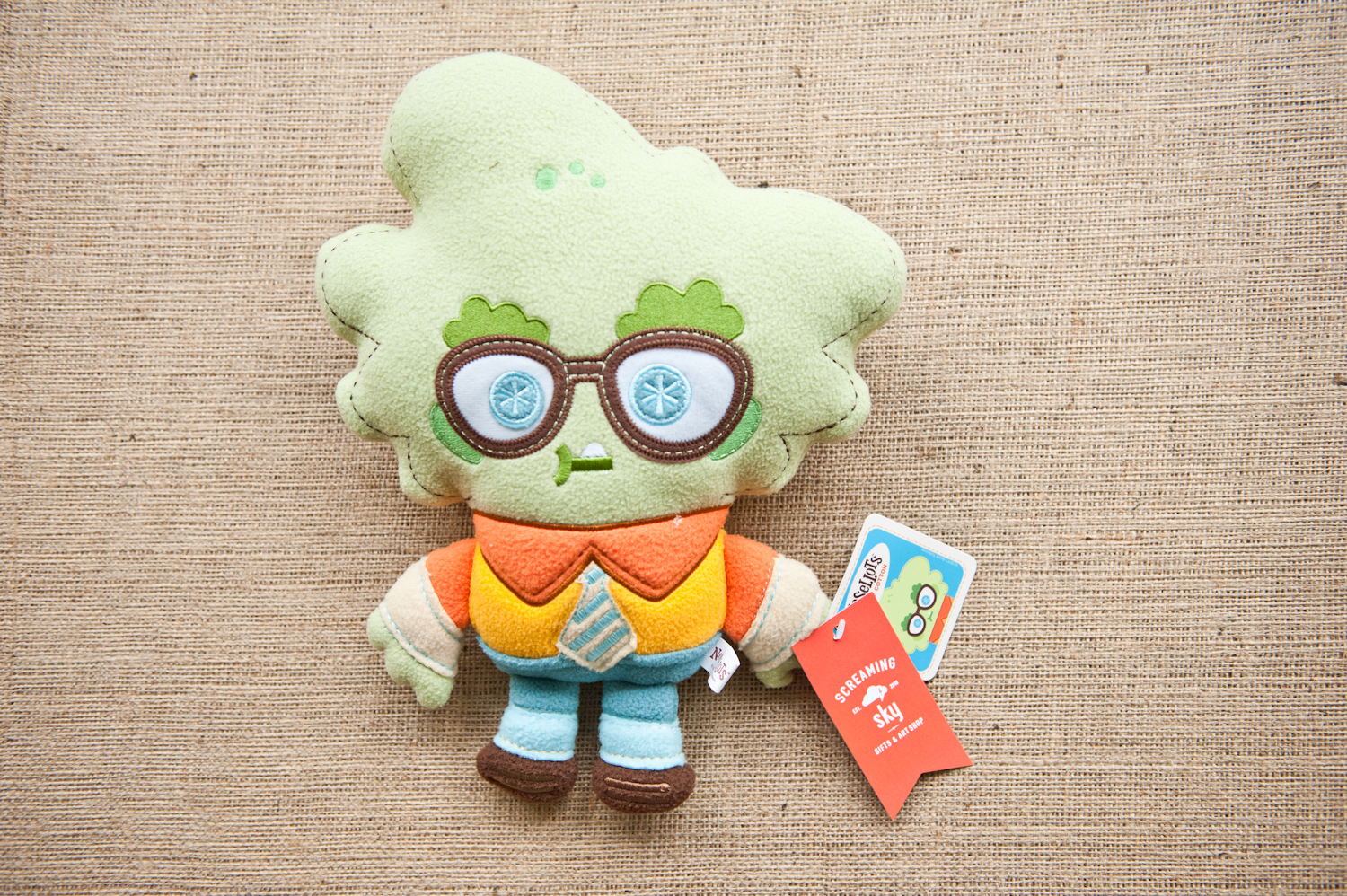
BRAND IMPLEMENTATION - Print Materials



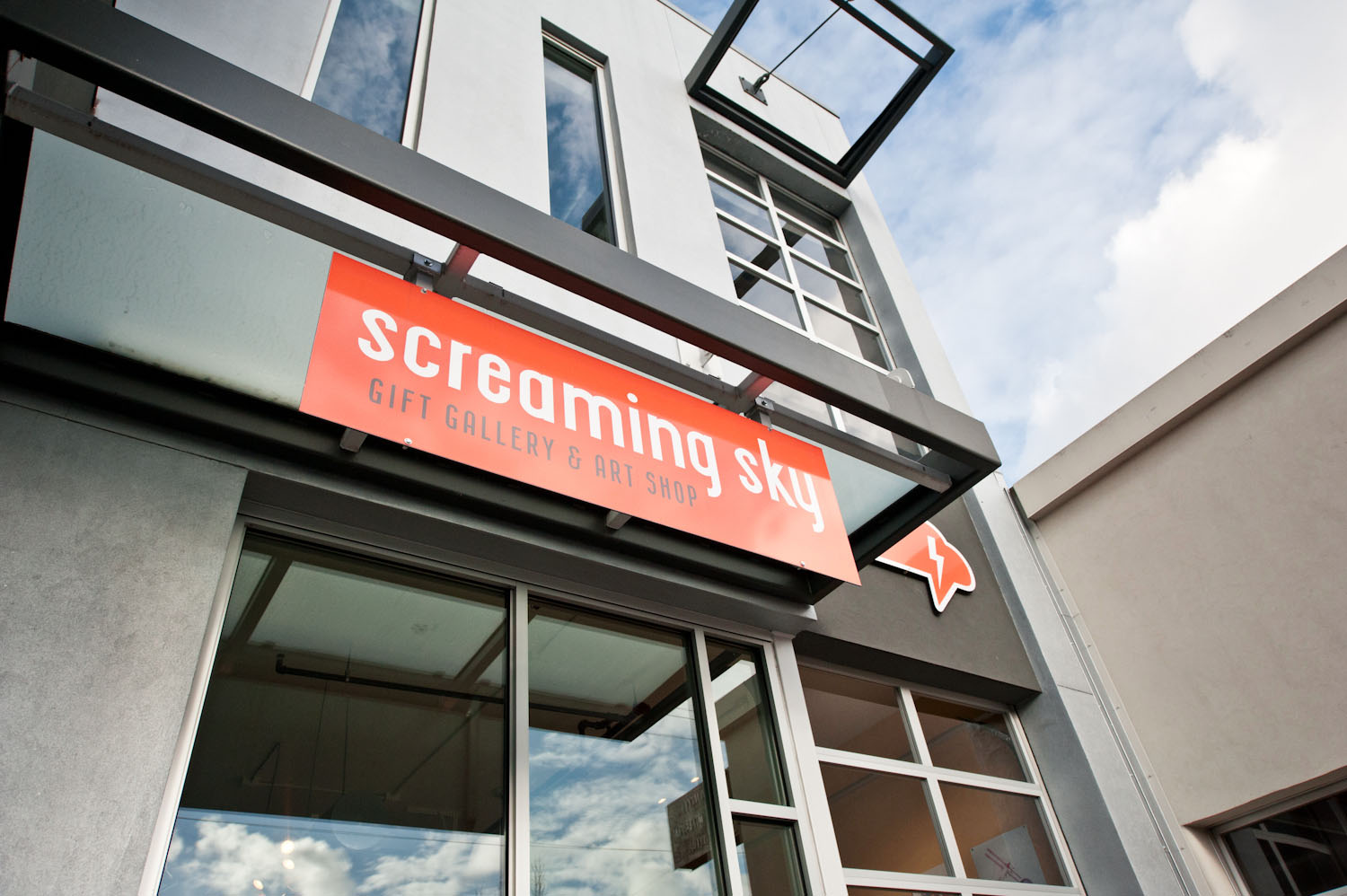
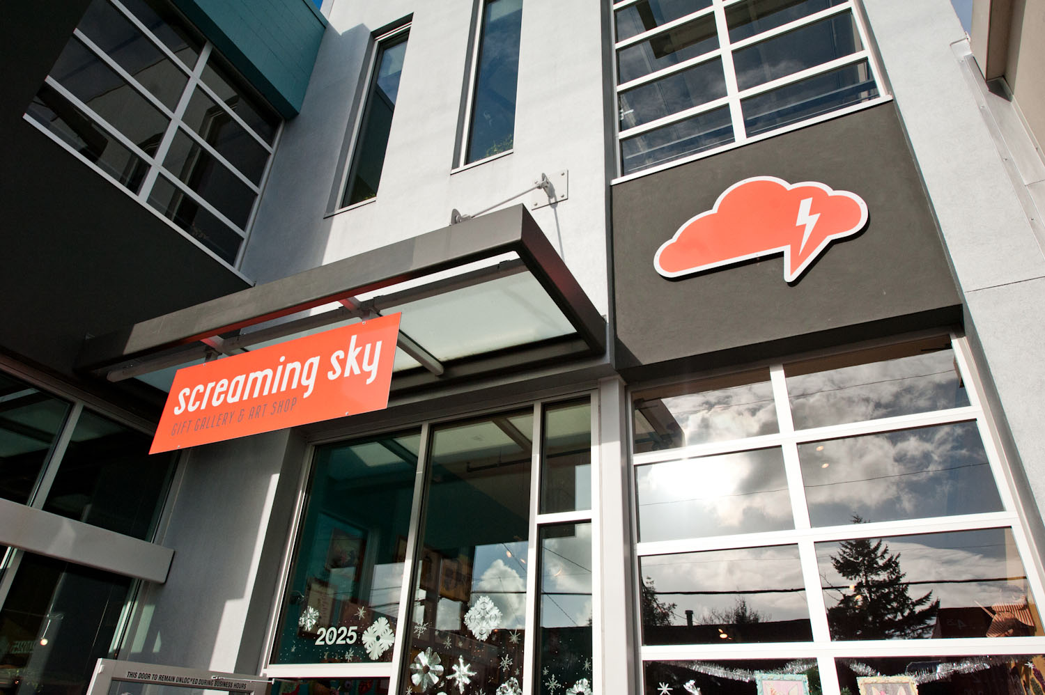
BRAND IMPLEMENTATION - Storefront Design
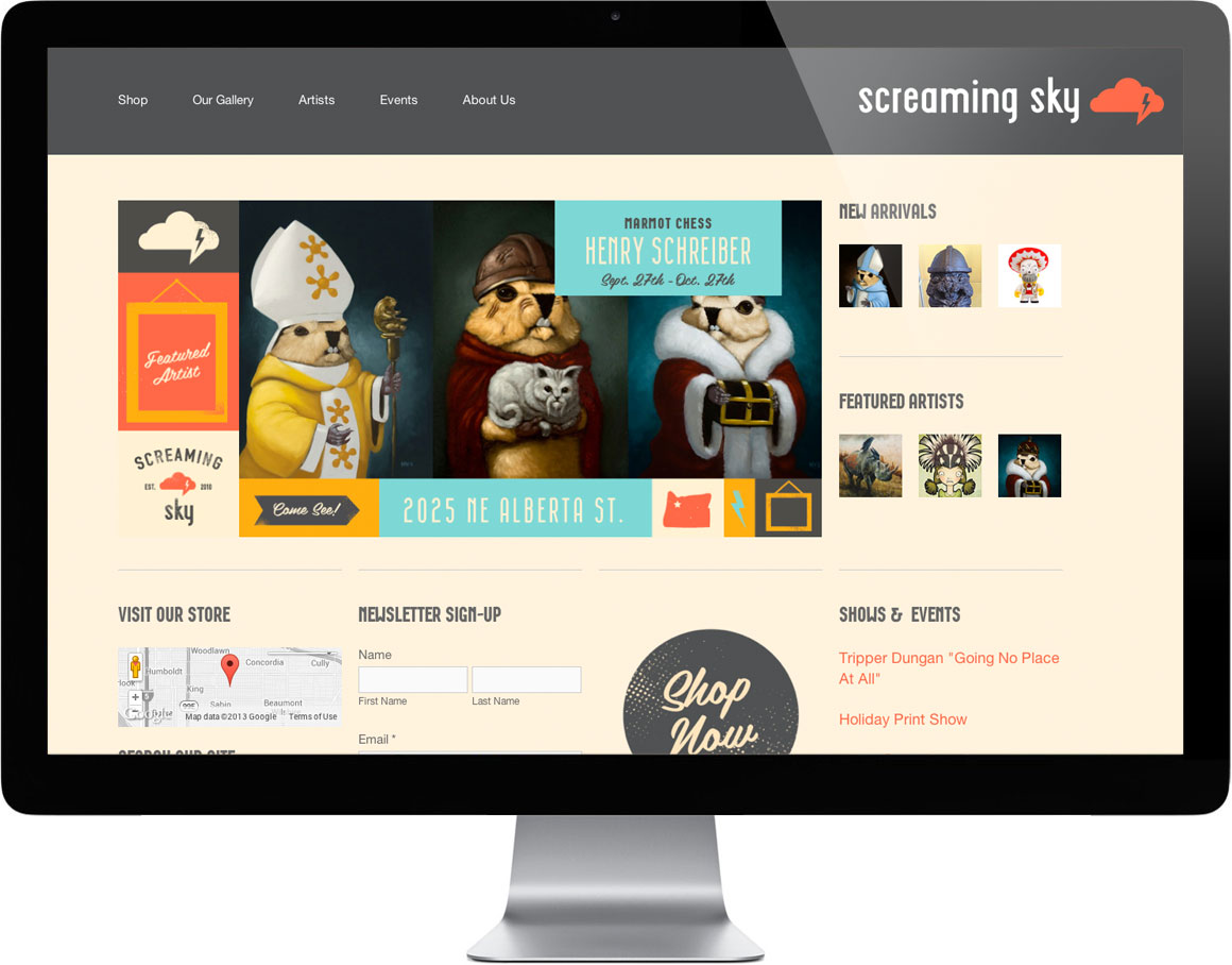
WEBSITE DESIGN - E-Commerce
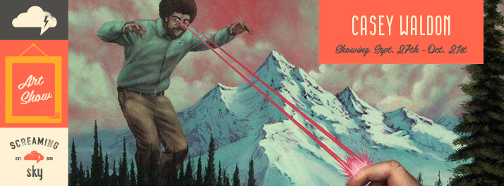
BRAND IMPLEMENTATION - Social Media Design
