A friend of ours took a photo of his cat, flying low that has become quite popular on the internet. We helped create this rendition to help him sell t-shirts to fans. See the original photo, see fan art, check out the website or pick up a shirt here: www.hoverkitty.com
New branding & logo for Portland gallery & retail
Can you guess the name of this company? Any guess you make may (or may not) be used as a tag-line ;-) New rebrand of this local gift gallery and art shop coming soon.
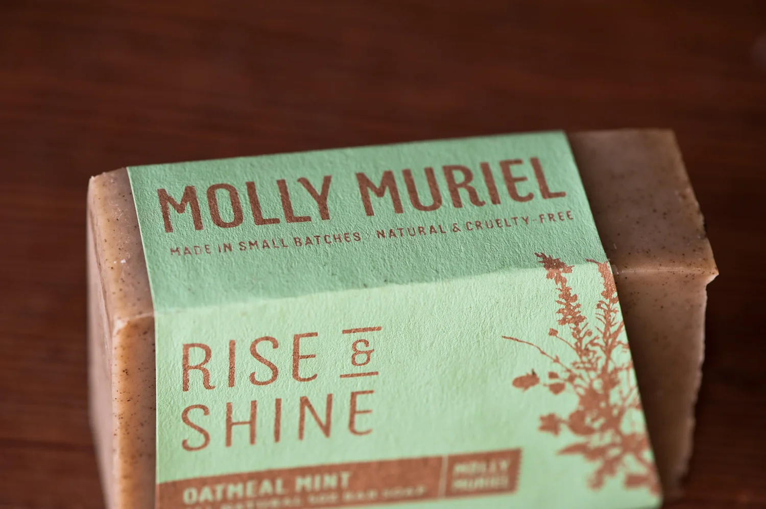
Website Design for Portland Soap Company
We're working on the full website design for Molly Muriel, a Portland-based soap and natural products company. More to come soon.
What if... Meadows Needs a New Lift?
Every once in a while we choose an organization we like and experiment with their identity on pure speculation to see how a new logo can change an image and make a first impression. A logo plays an important role in building an organization's reputation — Its like meeting someone for the first time. Surprisingly an organization's relationship with its customers is not unlike a personal relationship — a first impression can go a long way.
This year we had no other choice but to do a logo update for Mt Hood Meadows, as a large billboard was posted right outside of our office window. We had to take it upon ourselves to see if we had anything to offer this Oregon mainstay.
The first step (since we didn't have any client goals) was to create some. We wanted the Ski Resort to be different than its competitors (this one was obvious); We wanted it to appeal to a wide audience (from family sledders to young snowboarders); And we also wanted it to look like a mountain ski resort (and not a giant fish trying to eat the sun).
To make things more interesting we decided to add some limitations.
1) It needed to be a logo update (not a new logo or concept).
2) It needed to be made of 2 colors (instead of four).
3) It needed to be a retail brand. We wanted to create a platform for selling merchandise.
Here is the before and after...
The result was a solid identity with lots of personality and lots of potential for building a brand that is unique, friendly, and totally sellable. The updated identity is still approachable but would make Meadows feel more like a destination — a place where memories are born; A place where fun meets daring; A place where you can pick up a cool looking t-shirt and actually wear it in public.
It may not necessarily be epic, but a logo does't need to be epic. It just needs to identify the organization, be authentic, flexible, timeless, memorable, and the foundation of a system that communicates the value of the organization it represents.
Let us know what you think (be it good or be it bad) by adding a comment below.
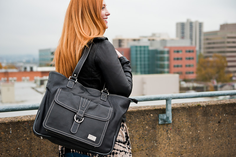
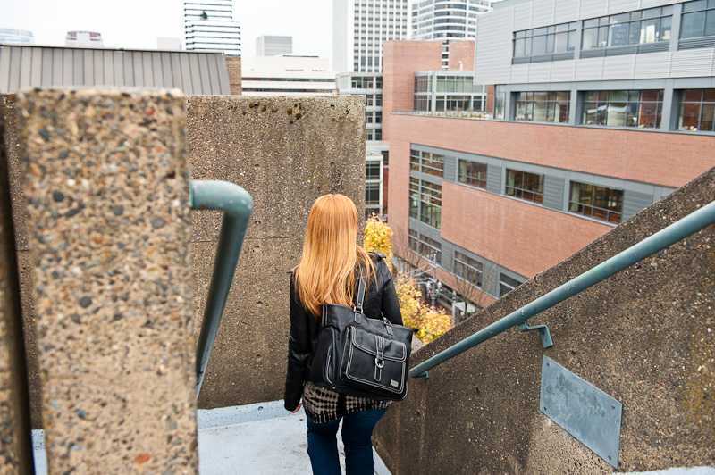
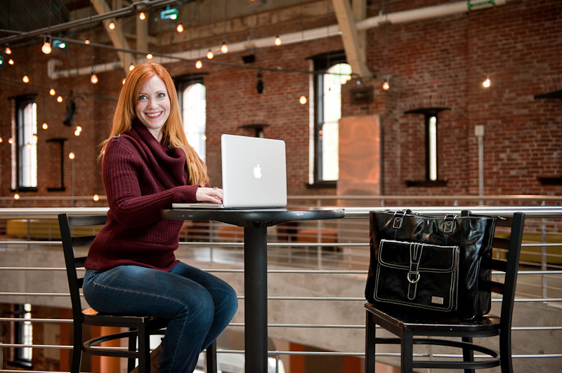
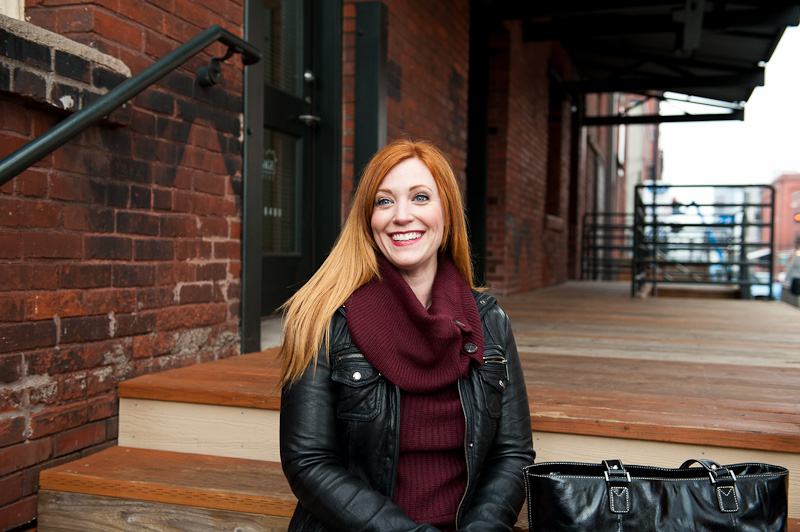
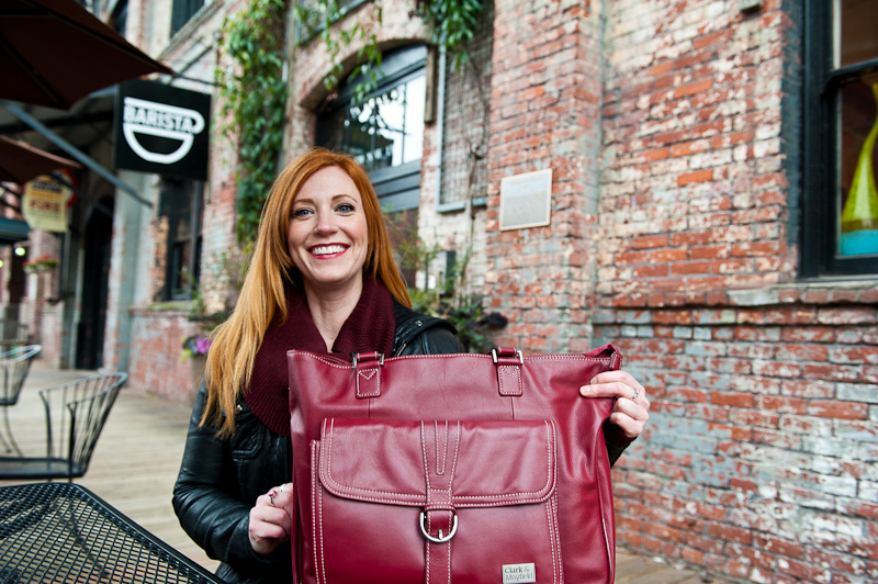
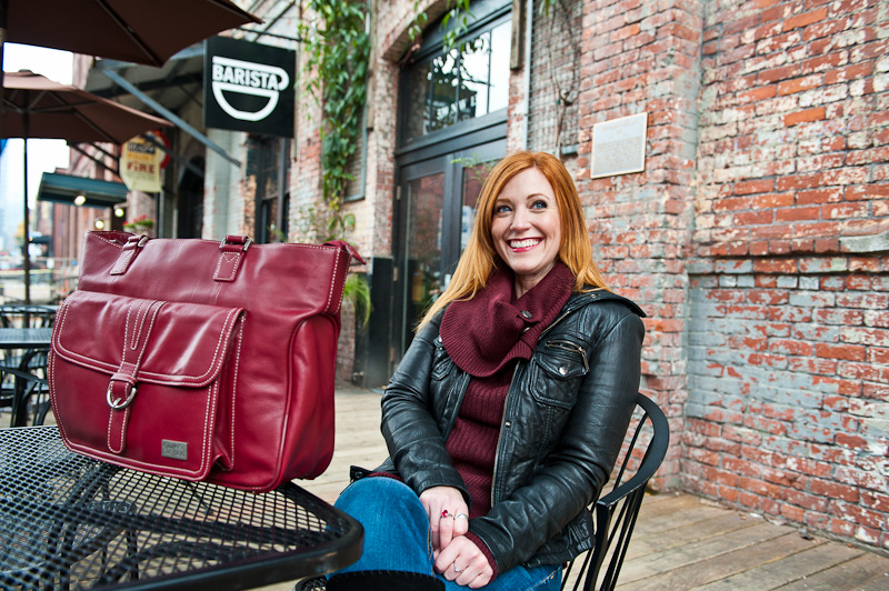
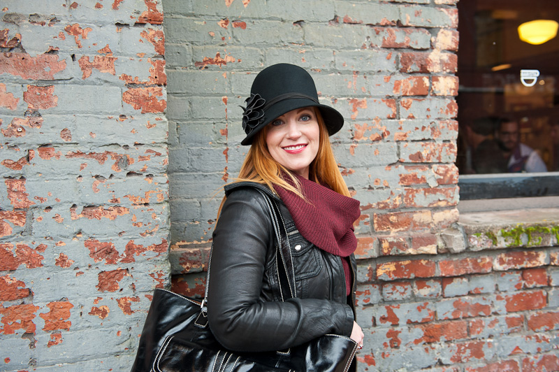
Fall/Winter Fashion Shoot for Women's Handbags
Just shot in downtown Portland on Friday for Clark & Mayfield. It was a fun shoot and the photos will help to promote the Stafford bag over the holidays and through the winter. Thanks to everyone who made this happen. Special thanks to Sublime for providing most of the wardrobe (sublimeclothingboutique.com). The bags can be found on clarkandmayfield.com.
Temporary Splash Page for Molly Muriel
We made a quick splash page for Molly Muriel (a local soap company) with only the necessities that will act as a placeholder until the new site launches.

Added Packaging Case Study for Molly Muriel
Since the new packaging for Molly Muriel hit the shelves in New Seasons, sales have nearly doubled. The all new packaging showcases the qualities of the product and matches the brand characteristics of being natural, handmade, and unique.
Learn more in the new case study for Molly Muriel.
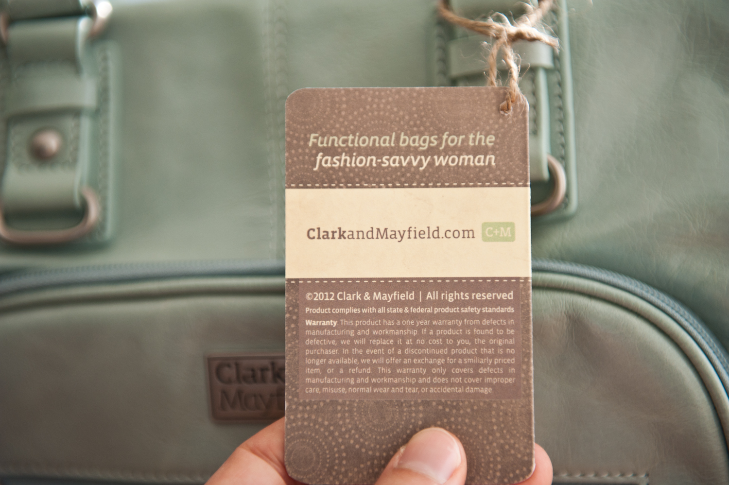
Fall/Winter 2012 Hangtags
We're updating the Clark & Mayfield hangtags for the upcoming season. The new hangtags help to reinforce the brand's positioning as a stylish and functional women's technology bag. More coming for C&M including fall/winter photoshoots...
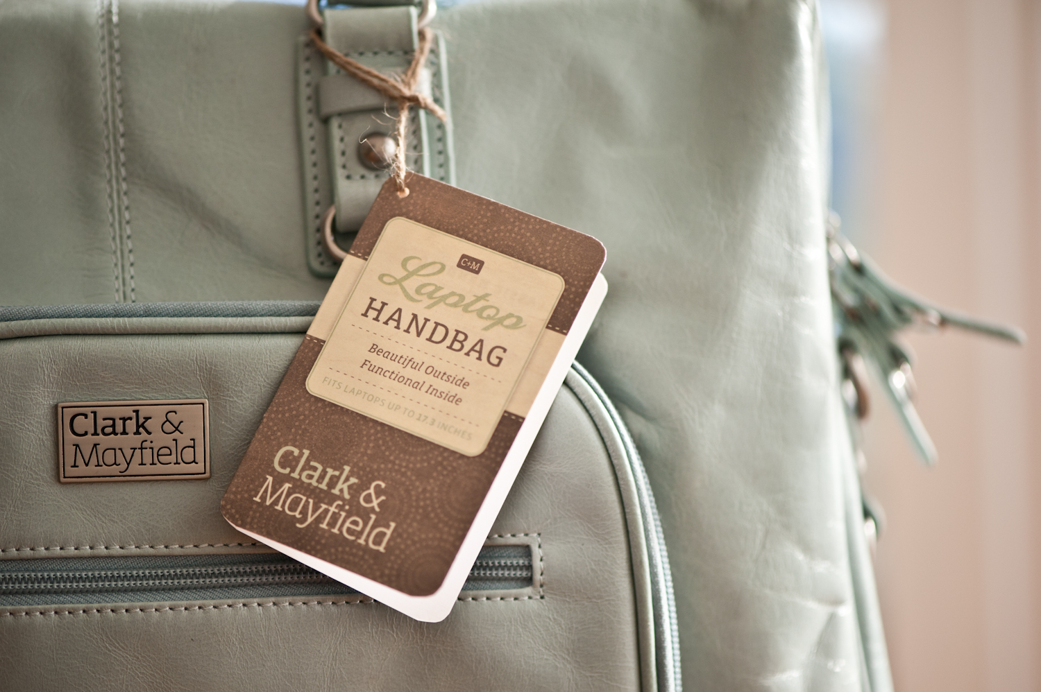
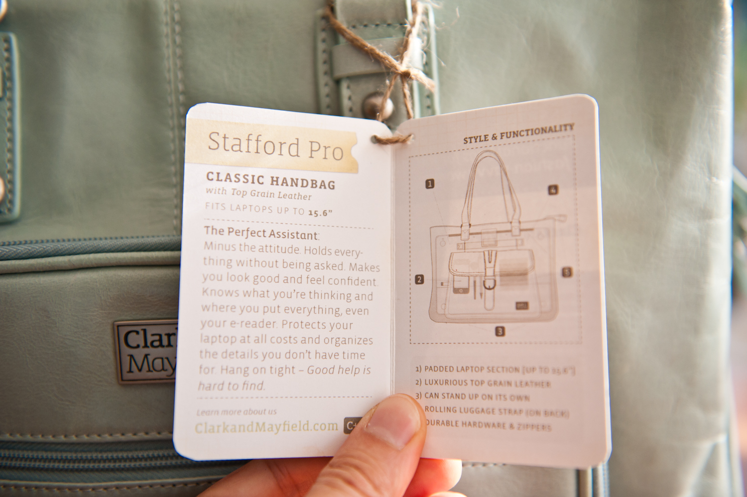
We're updating the Clark & Mayfield hangtags for the upcoming season. The new hangtags help to reinforce the brand's positioning as a stylish and functional women's technology bag. More coming for C&M including fall/winter photoshoots...
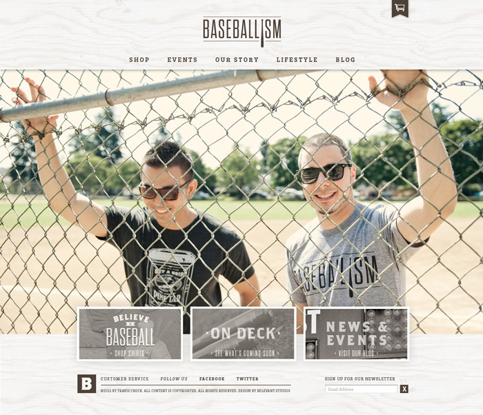
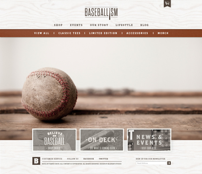
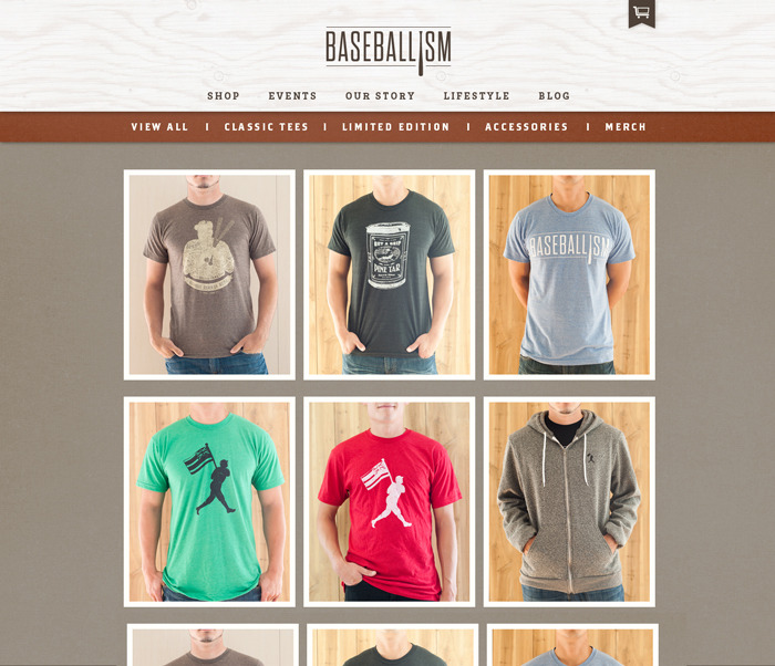
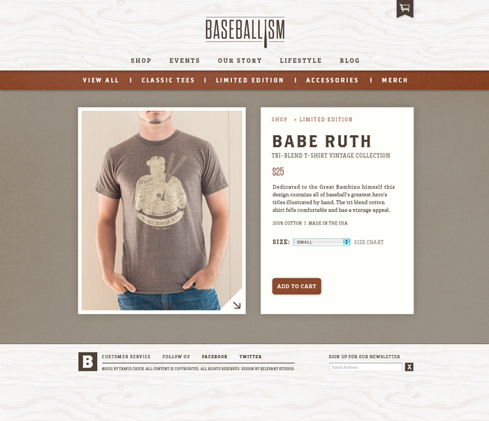
E-Commerce Web Design for Baseballism
A new site for Baseballism is in the works which will launch this fall. The site is clean and features large lifestyle images that really create focus on the content and draw people in to the products themselves.
See the Kickstarter Video we made that helped them get funded.
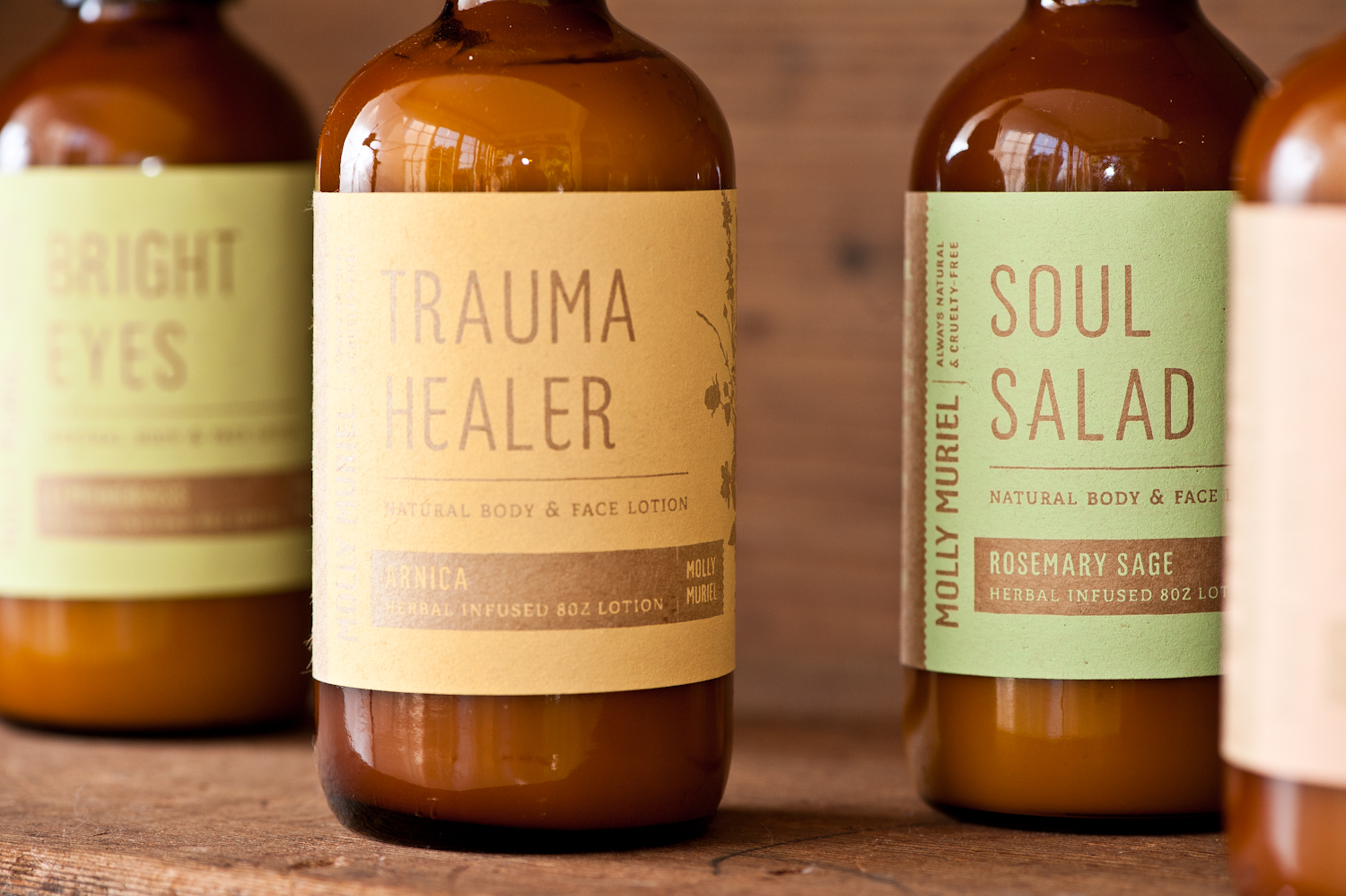
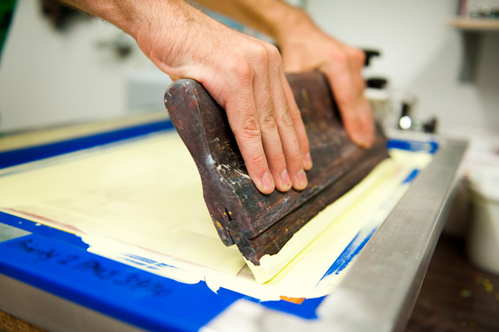
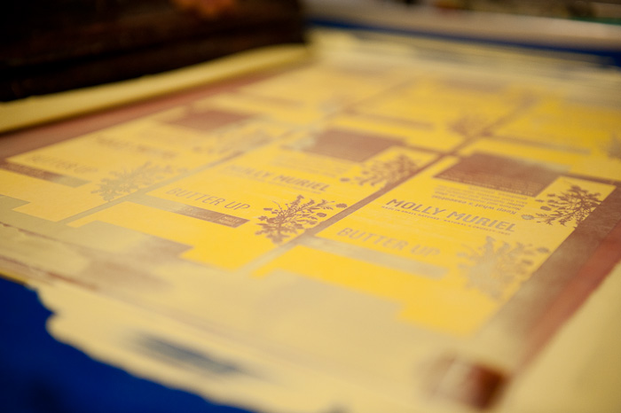
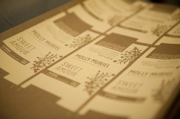
Screen-printed packaging for local soap company
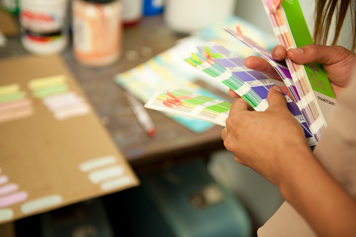
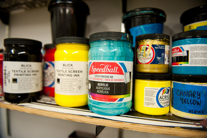
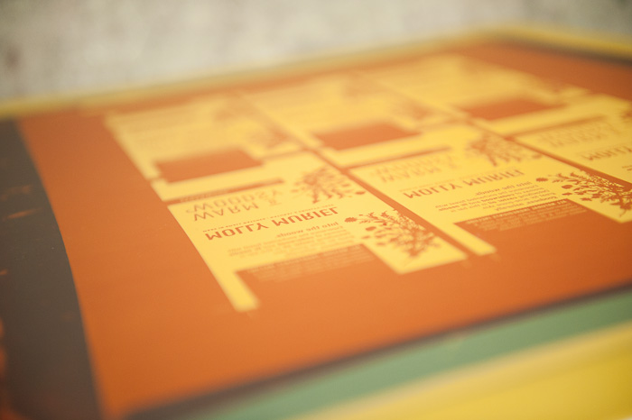
All new packaging designed by Relevant Studios & screen-printed by Tender Loving Empire all for a local home, bath, & body company called Molly Muriel. We felt that the hand made soaps deserved some extra-ordinary hand-made packaging to make customers pick them up and sniff. The new branding and packaging will surely help the already amazing products stand out amongst the flack. We're looking forward to seeing the final product in its final package just in time for the San Francisco International Gift Fair!
New identity for The Herb Shoppe
We're working with The Herb Shoppe to redesign their identity and packaging. Below is the core identity that we will we building communication pieces from and that will be the foundation for the new packaging system (which will be coming soon).
The Herb Shoppe has two lovely locations — one in Brooklyn New York and one in Portland Oregon and the identity will appeal to audiences in both locales. Traditional Medicine for Modern Times is the message or positioning statement for the organization and the Identity was designed to be timeless (applicable to both the history and future of natural medicine).
And here is the design for the new business cards. We will take some pictures of the cards and the rest of the stationery set as soon as they are printed.

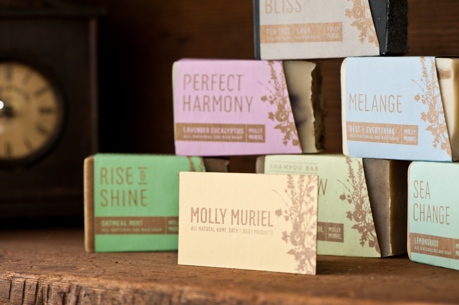
Packaging (in progress) for Local Natural Soap Co.


Here's one of our concepts that we're working on for a full-line packaging project. The hand-done printing process along with the clean design will certainly help differentiate Molly Muriel from the rest. Partly backed by a grant from the amazing Mercy Corps NW, the new packaging will help position this Portland company for continued success and future growth.
More to come for Molly Muriel soon.
