
2 Brothers Moving
CHALLENGE - Since creating the initial identity and brand positioning in 2007 the company has grown and evolved quite a bit. As a company evolves so should the brand.
ACTION - Now in 2012, we are helping to breathe new life into the brand by creating all-new creative including additional brand assets and custom illustration.
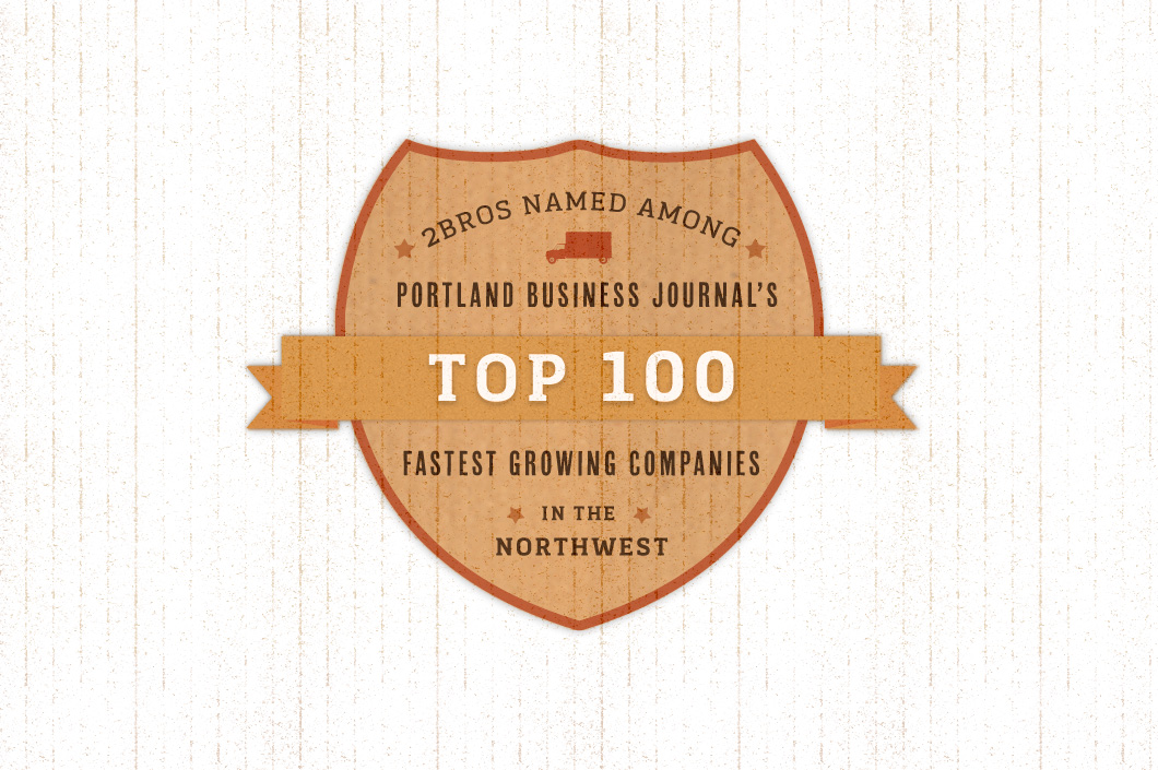
RESULTS - 2Brothers was recognized in 2012 as one of the fastest growing privately held companies in Oregon and has become a trusted name throughout the greater Portland area.
FROM THE CLIENT
Imagine how your grandma felt the first time she saw Television. That's how you'll feel when you have your Brand built by Relevant.
~ ADAM (Owner)
WEBSITE
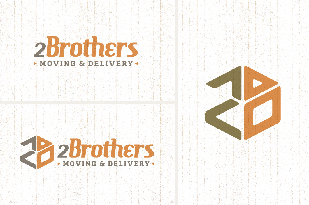
BRAND IDENTITY - Visual Assets
BRAND IDENTITY - Primary & Secondary Color Palettes

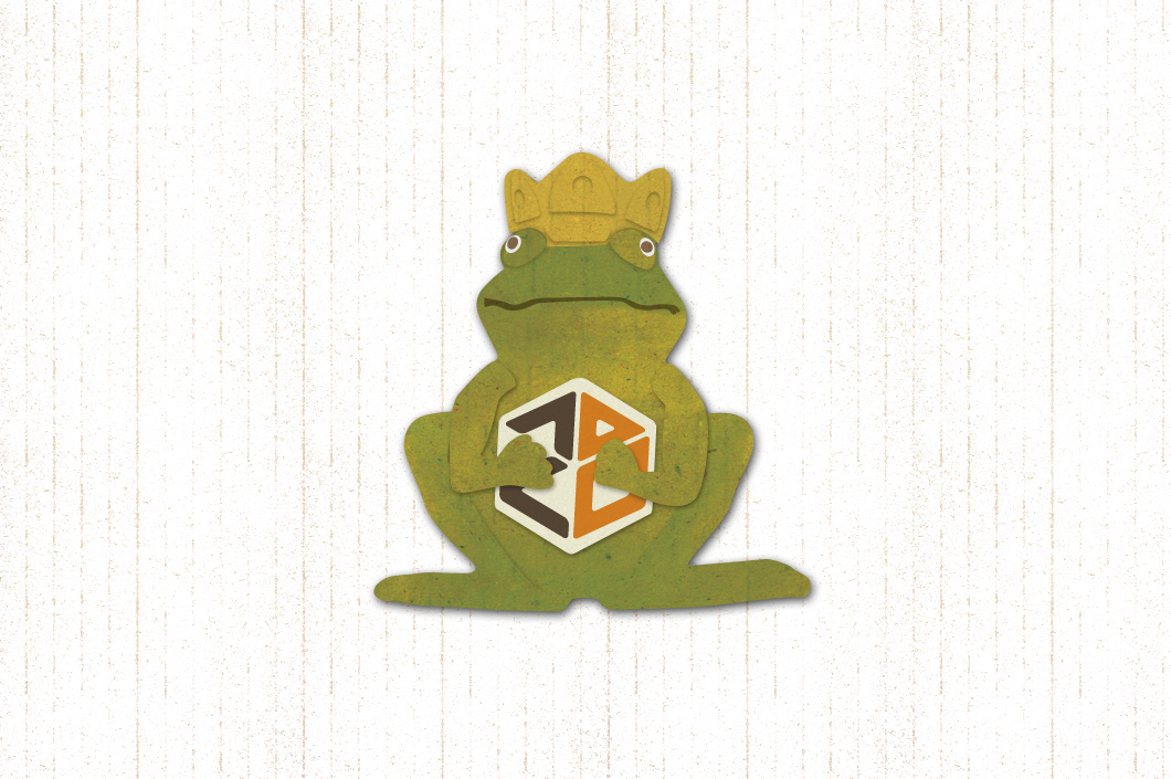
CONTENT DEVELOPMENT - Campaign Illustrations
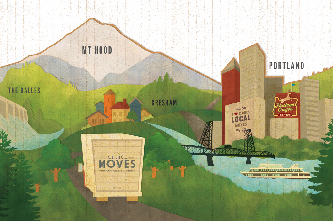
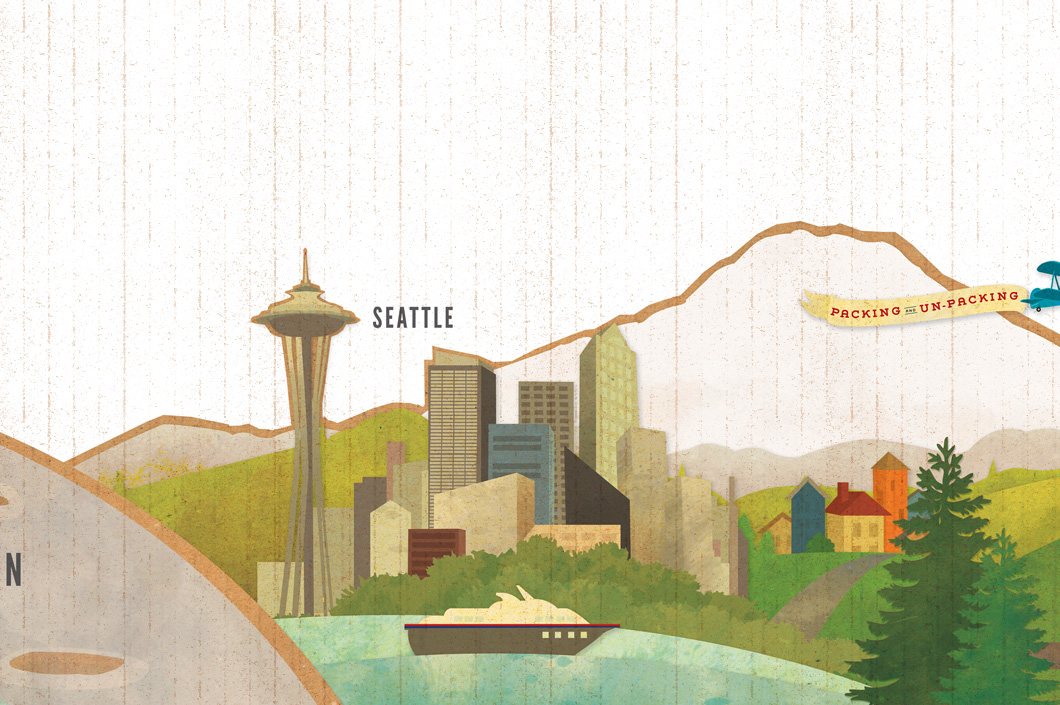
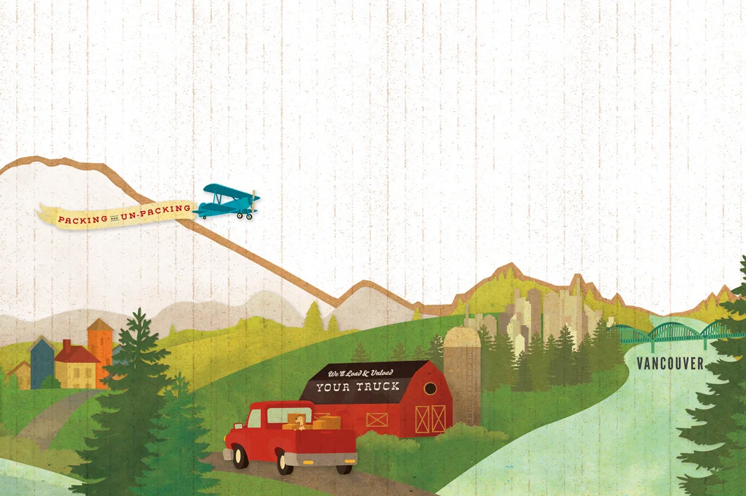
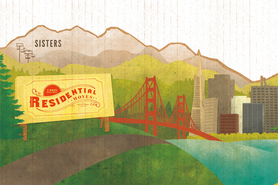
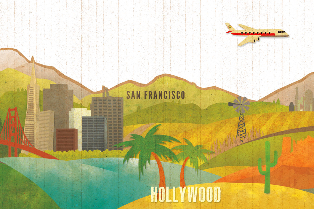
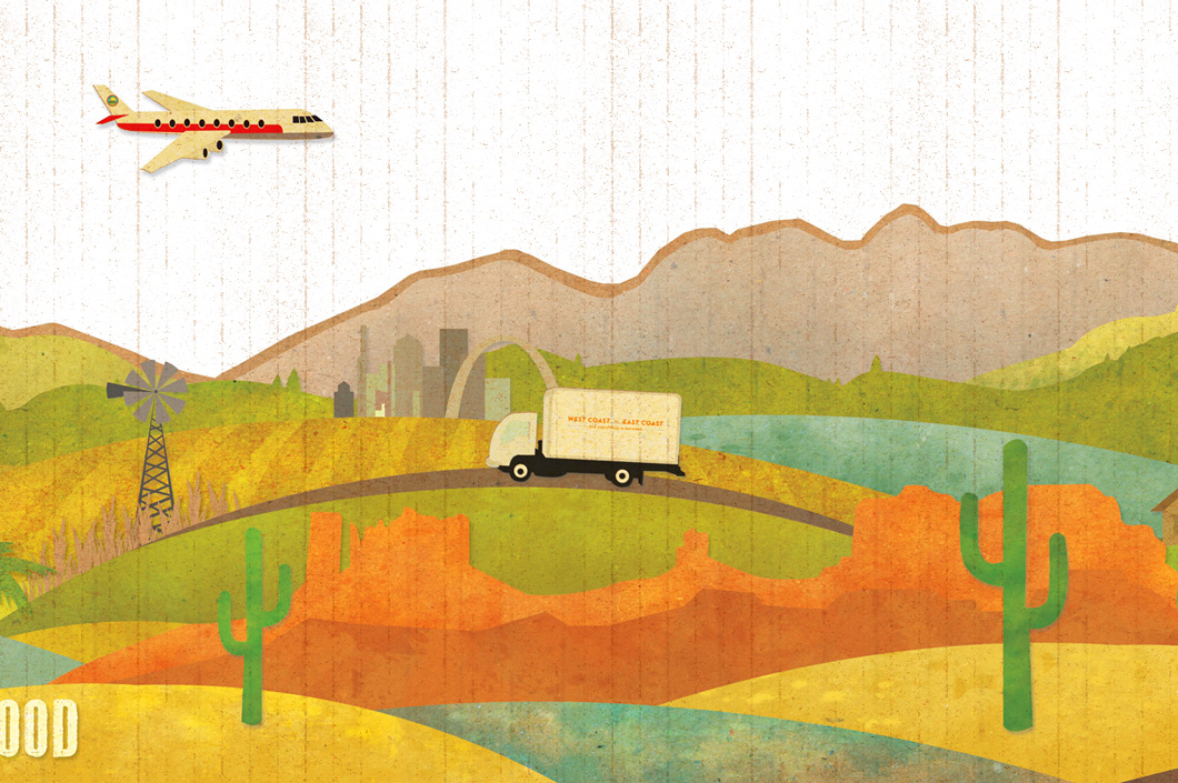
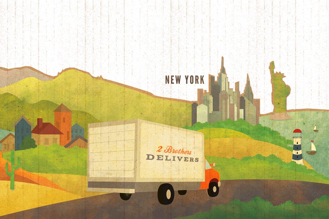
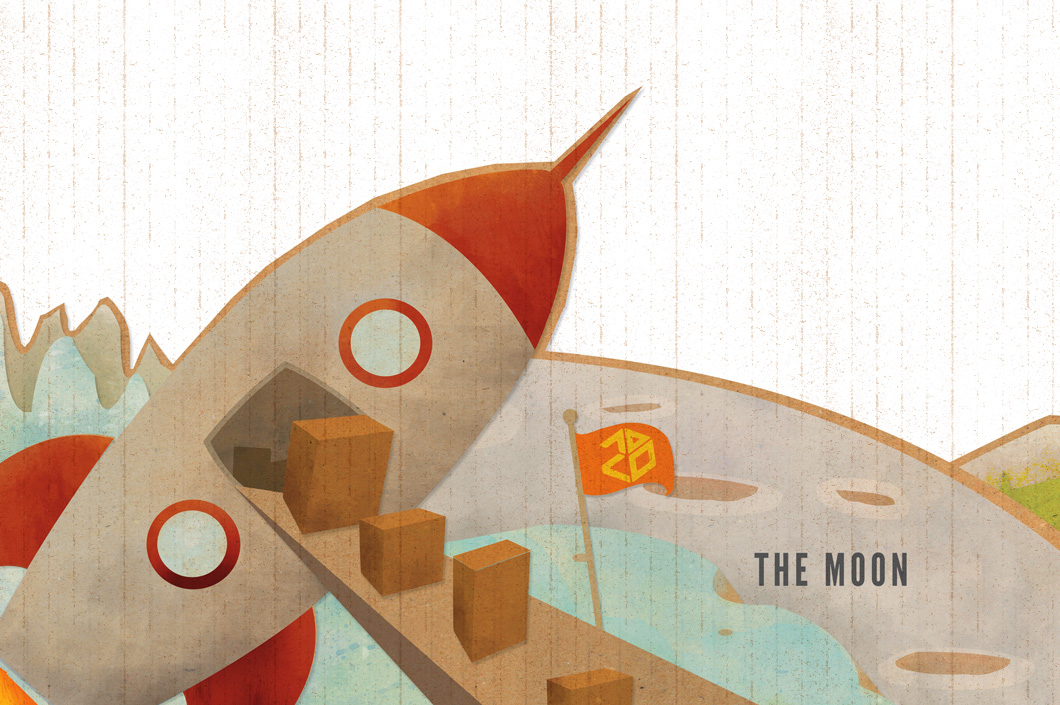
Local, Long-Distance, or Across the Nation is the theme for the all-new creative for 2 Brothers. The new illustration and brand assets will be seen on everything from truck wraps to business cards as we roll out the updated brand over the period of one year.
BRAND IMPLEMENTATION - Truck Wrap
INTERACTIVE - Website Design & Development


INTERACTIVE - Responsive Design

The 2 Brothers website is built to be responsive which means that one site works on Computers, Tablets, and Mobile Devices as the layout adapts to whatever size browser users have.


