We're working on the full website design for Molly Muriel, a Portland-based soap and natural products company. More to come soon.
Identity for a Truly Portland Real Estate Company
A new brand is emerging in the Real Estate community that offers a straight-forward, yet forward-thinking approach. The identity and website will showcase the broker's experience, capabilities, and down-to-Portland demeanor.
Temporary Splash Page for Molly Muriel
We made a quick splash page for Molly Muriel (a local soap company) with only the necessities that will act as a placeholder until the new site launches.
Added Packaging Case Study for Molly Muriel
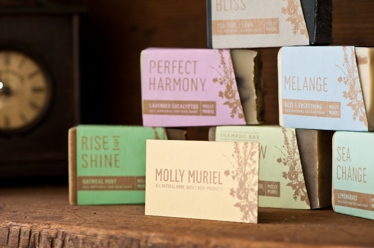
Since the new packaging for Molly Muriel hit the shelves in New Seasons, sales have nearly doubled. The all new packaging showcases the qualities of the product and matches the brand characteristics of being natural, handmade, and unique.
Learn more in the new case study for Molly Muriel.
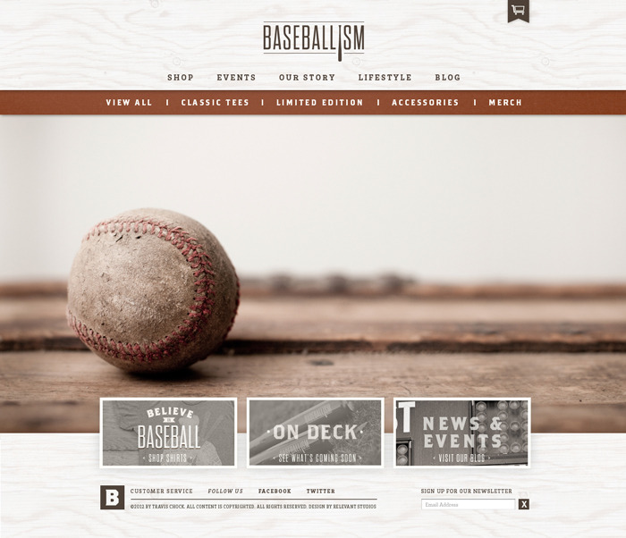
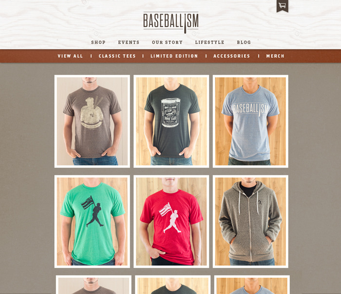
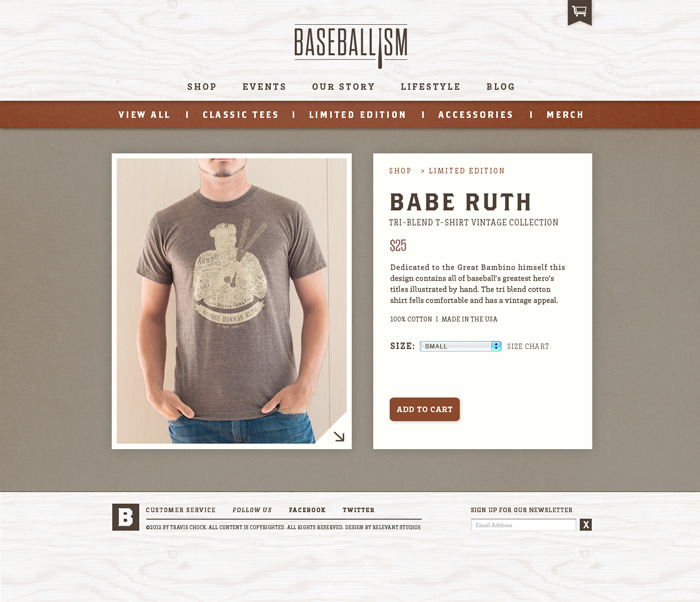
E-Commerce Web Design for Baseballism
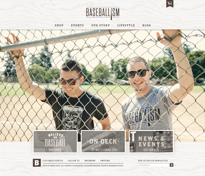
A new site for Baseballism is in the works which will launch this fall. The site is clean and features large lifestyle images that really create focus on the content and draw people in to the products themselves.
See the Kickstarter Video we made that helped them get funded.
Press Check for CMD Stationery
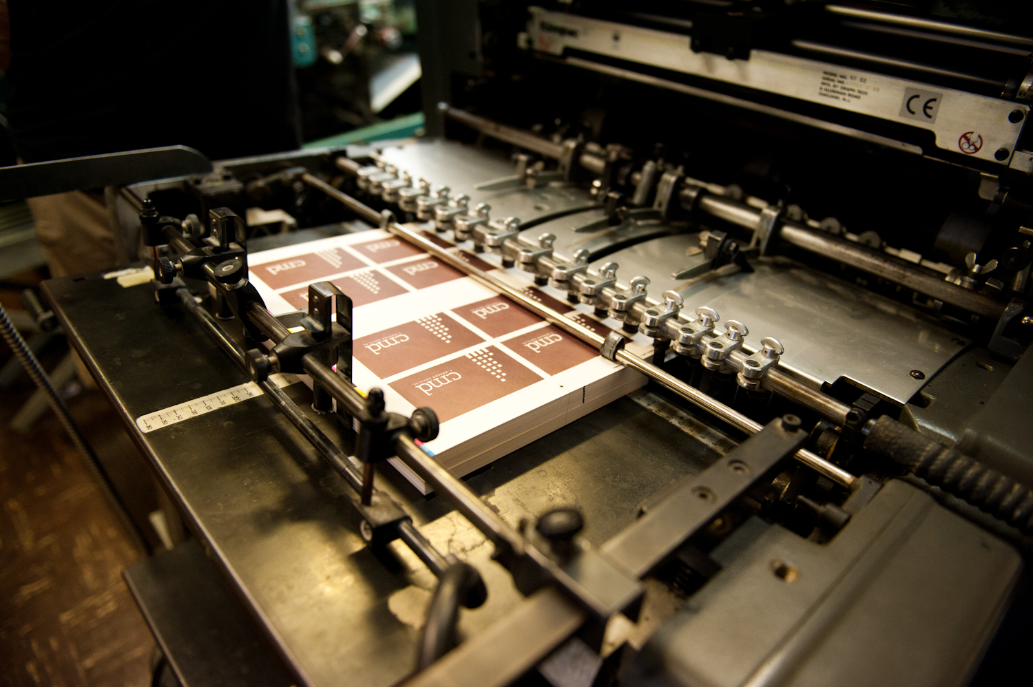
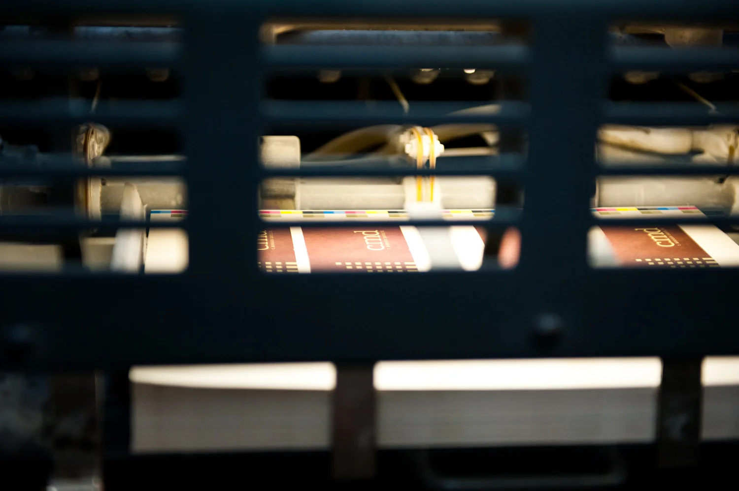
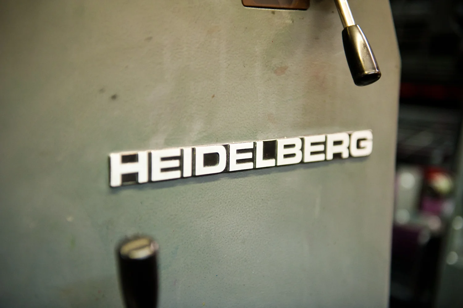
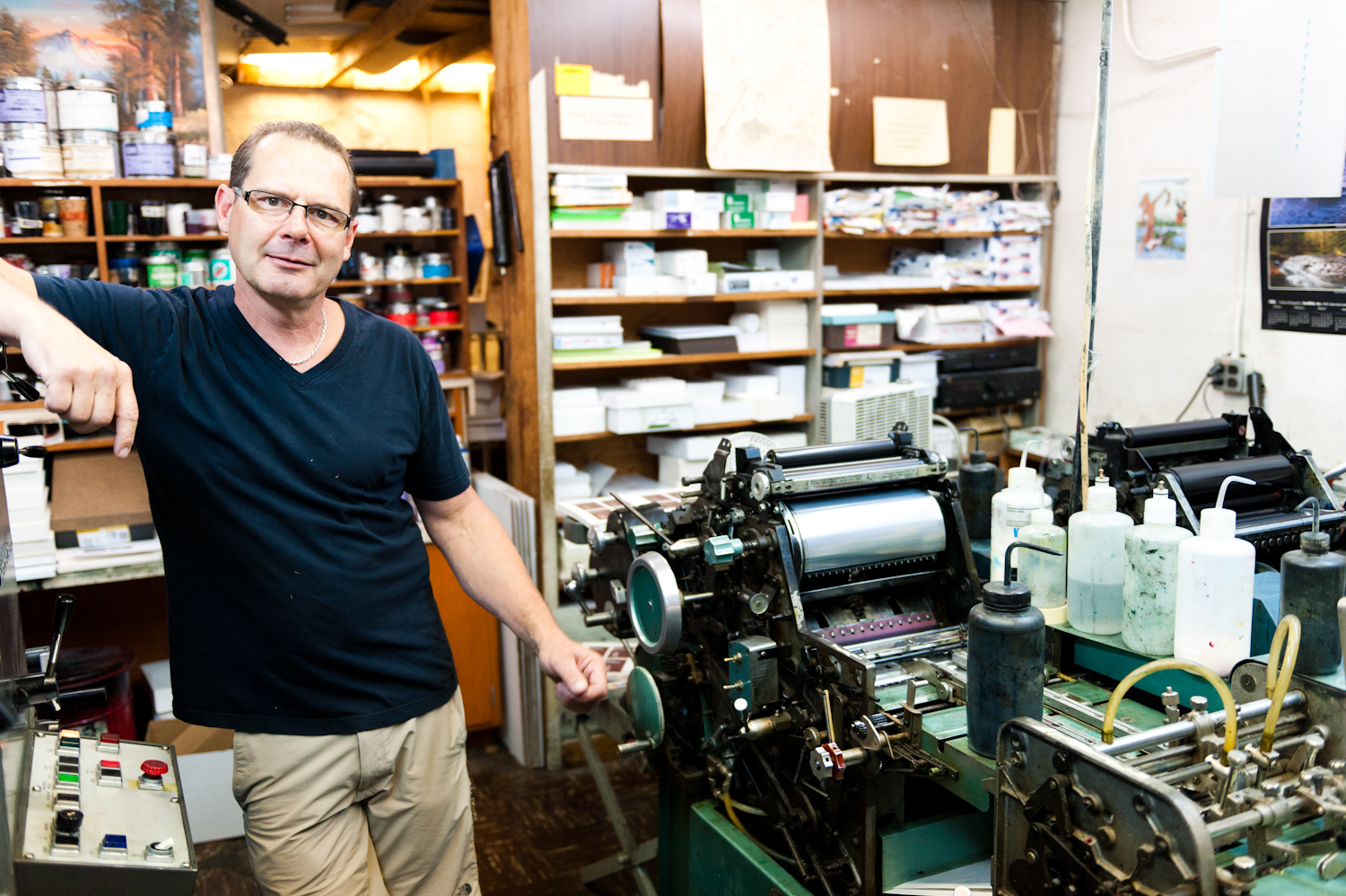
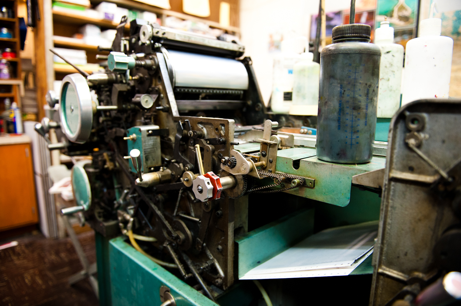
We did a press check today for the stationery set designed for C. Morgan Davis. Dan and the team at Francis Printing are helping us to produce the final product. Dan has been running a press since he was twelve and is the owner of the local family-based business in Southeast Portland. The new stationery design will help to postion CMD for future growth and will match the new website currently in development.
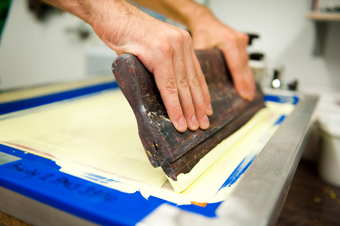
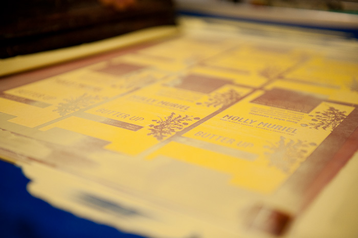
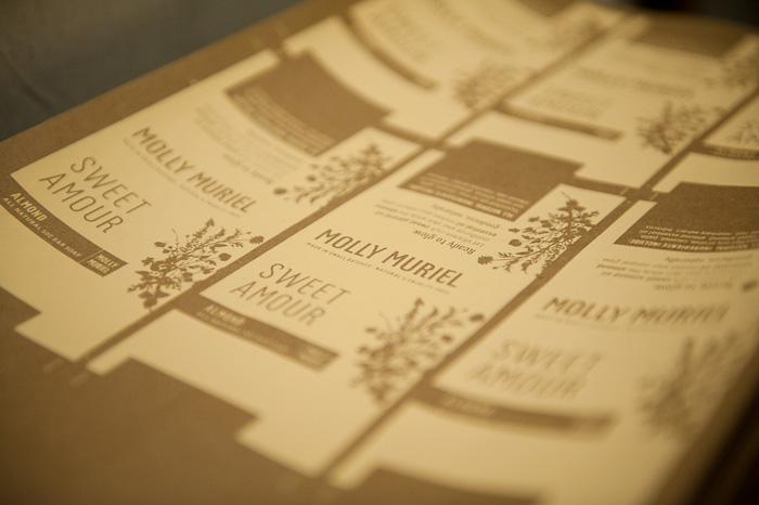
Screen-printed packaging for local soap company
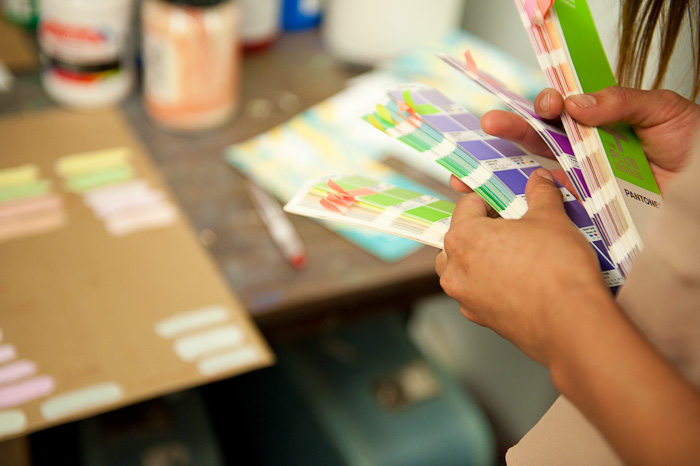
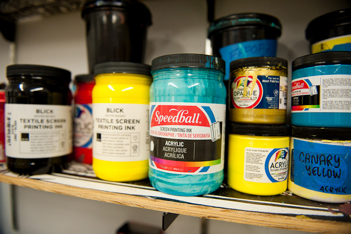
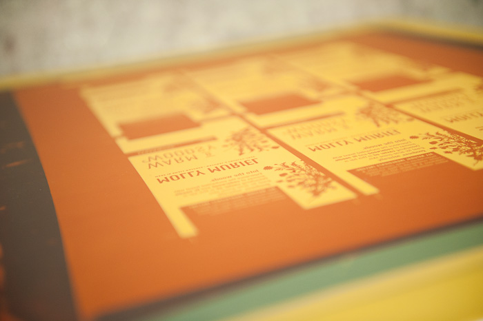
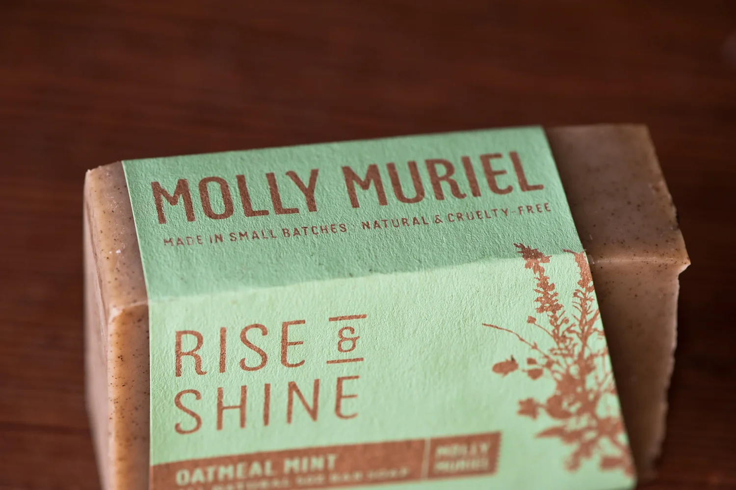
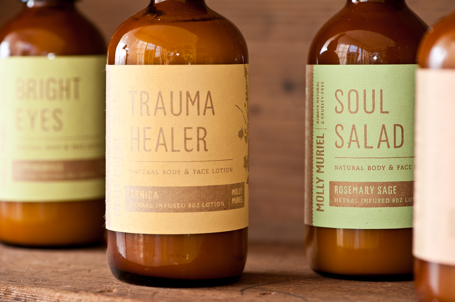
All new packaging designed by Relevant Studios & screen-printed by Tender Loving Empire all for a local home, bath, & body company called Molly Muriel. We felt that the hand made soaps deserved some extra-ordinary hand-made packaging to make customers pick them up and sniff. The new branding and packaging will surely help the already amazing products stand out amongst the flack. We're looking forward to seeing the final product in its final package just in time for the San Francisco International Gift Fair!
New identity for The Herb Shoppe
We're working with The Herb Shoppe to redesign their identity and packaging. Below is the core identity that we will we building communication pieces from and that will be the foundation for the new packaging system (which will be coming soon).
The Herb Shoppe has two lovely locations — one in Brooklyn New York and one in Portland Oregon and the identity will appeal to audiences in both locales. Traditional Medicine for Modern Times is the message or positioning statement for the organization and the Identity was designed to be timeless (applicable to both the history and future of natural medicine).
And here is the design for the new business cards. We will take some pictures of the cards and the rest of the stationery set as soon as they are printed.
2 Brothers Website Launched
We just launched the newly branded website for 2 Brothers Moving & Delivery. The website features a Responsive design that works seemlessly on multiple devices including PC, Tablet, & Mobile. The site is complete with custom designed pages and interactive widgets that communicate the value of the company and its services. The site is friendly, thoughtful, easy to use, and an ode to Portland that will resonate with the company's audience and draw them into to the great service that 2 Brothers offers.
See it live: 2brothersmoving.net
Interactive Website Widget Created for the 2 Brothers Website
The new interactive widget is a great way for poeple to understand how pricing works so they can get a good idea of how much their move might cost. The widget calculates an hourly rate based upon the square footage of the space and the level of service a user wants. Complete with custom graphics and is completely Responsive on mobile devices.
See the widget in action at 2brothersmoving.net/services/local-moves
2 Brothers Awarded Top 100 Fastest-Growing Companies in Oregon
Congratulations to 2 Brothers Moving for being awarded one of the top 100 fastest-growing privately held companies in Oregon! (Portland Business Journal - Recipient List). Bravo!
2 Brothers is a stellar example of how intentional branding creates a platform for helping companies grow and succeed. Owner Adam Sweet has partnered with Relevant Studios to provide design and brand management since he launched 2 Brothers back in 2007. As we continue to evolve the brand together, we will help position 2 Brothers for continued growth and success.
Branding isn't the only thing to blame for the company's success (as much as we'd like to take credit). Adam is a visionary that has done an amazing job ensuring that 2 Brothers truly serves its customers in a professional, friendly, and authentic way. That approach is what makes branding for small businesses so powerful.
Adam has always been great at handing us his ideas and letting us come back with creative solutions that exceed his expectations. We pay close attention to his goals, and in turn he trusts us to help him make decisions that influence his brand. This collaborative process helps us articulate and share his vision with Portland customers!
We're excited to be working with 2 Brothers and to see what's next for this small company with big ideas.
Interactive Website Design for a Realty Co. in our Neck of the Woods
We're working on a website for a local Realtor who's not only genuine but knows how to get the job done. The site will showcase the character and competency of C. Morgan Davis in an authentic way featuring video testimonials and other rich content that's typically unheard of in the Real Estate industry.
We highly recommend them if you're looking to buy or sell a home.


