What is Identity-driven Branding?

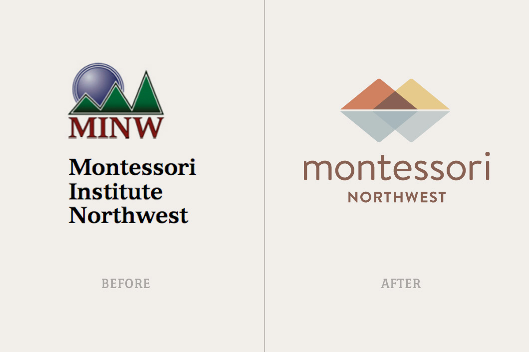
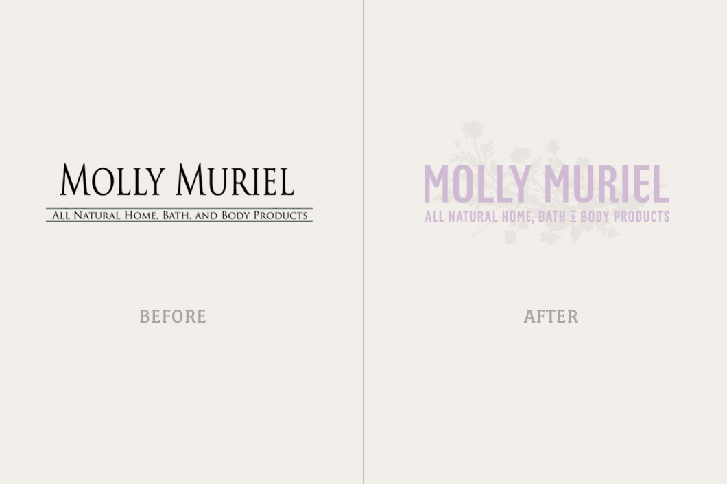
We believe that a brand's identity is the most important catalyst for potential growth and success and a powerful identity starts with a strong logo.

A logo is a word-mark or symbol (or combination of the two) that serves to represent a brand. A good logo will help to provide recognizability and consistency for a brand and is the key-stone of any successful Identity System.

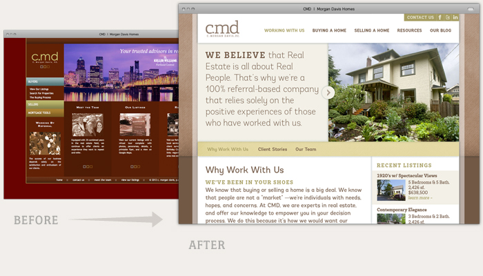
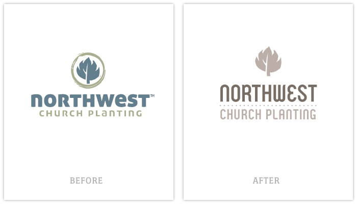
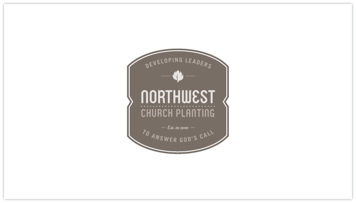
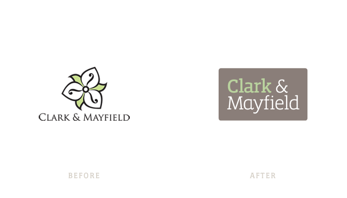
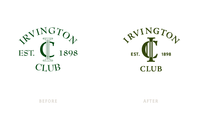
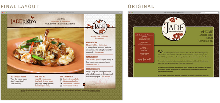
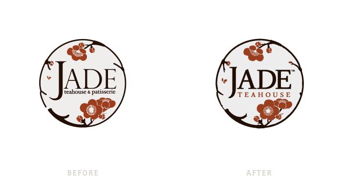
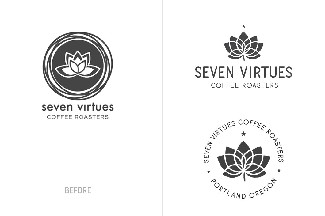
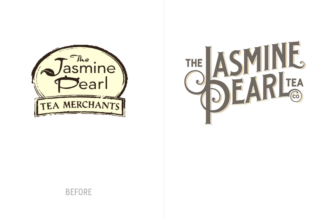
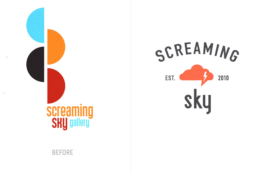
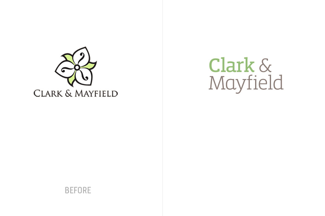
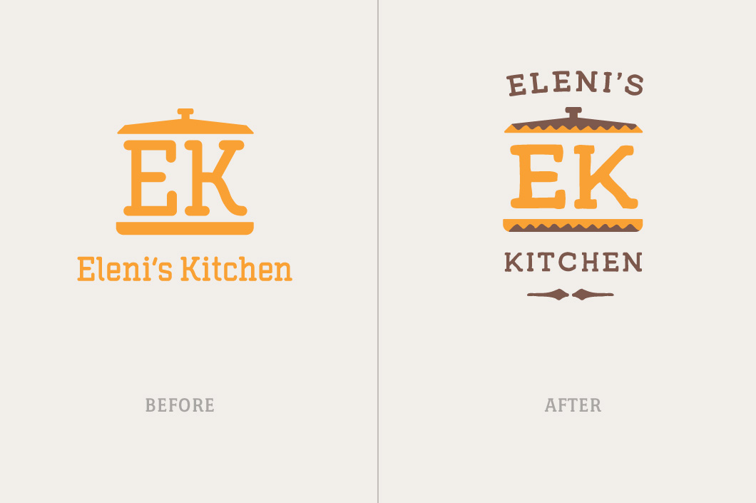
When we engage a potential brand (company, product, service, or idea) to work with, we always assess the logo and identity first. Above are some recent logo updates and overhauls that we developed before letting the client invest further in their brand.

What if... Meadows Needs a New Lift?

Every once in a while we choose an organization we like and experiment with their identity on pure speculation to see how a new logo can change an image and make a first impression. A logo plays an important role in building an organization's reputation — Its like meeting someone for the first time. Surprisingly an organization's relationship with its customers is not unlike a personal relationship — a first impression can go a long way.

hood.logo.original.gif

This year we had no other choice but to do a logo update for Mt Hood Meadows, as a large billboard was posted right outside of our office window. We had to take it upon ourselves to see if we had anything to offer this Oregon mainstay.

The first step (since we didn't have any client goals) was to create some. We wanted the Ski Resort to be different than its competitors (this one was obvious); We wanted it to appeal to a wide audience (from family sledders to young snowboarders); And we also wanted it to look like a mountain ski resort (and not a giant fish trying to eat the sun).

To make things more interesting we decided to add some limitations.

1) It needed to be a logo update (not a new logo or concept).

2) It needed to be made of 2 colors (instead of four).

3) It needed to be a retail brand. We wanted to create a platform for selling merchandise.

Here is the before and after...

hood.logo.before.gif

The result was a solid identity with lots of personality and lots of potential for building a brand that is unique, friendly, and totally sellable. The updated identity is still approachable but would make Meadows feel more like a destination — a place where memories are born; A place where fun meets daring; A place where you can pick up a cool looking t-shirt and actually wear it in public.

It may not necessarily be epic, but a logo does't need to be epic. It just needs to identify the organization, be authentic, flexible, timeless, memorable, and the foundation of a system that communicates the value of the organization it represents.

Let us know what you think (be it good or be it bad) by adding a comment below.

hood.logo.gif

JVC Northwest Website Design (Before & After)

Before and after look at the website design for the Jesuit Volunteer Corps Northwest.​

Brand Identity Update for Local Non-Profit (in progress)

We're in the process of updating an identity for the Jesuit Volunteer Corps Northwest. We're bringing their identity up to date before we move into helping them develop an all new website that will more effectively communicatate their message and help to reach their audiences.

jvcnw.logo.before.gif

We're in the process of updating an identity for the Jesuit Volunteer Corps Northwest. We're bringing their identity up to date before we move into helping them develop an all new website that will more effectively communicatate their message and help to reach their audiences.

C. Morgan Davis Website (Before & After)

The new website will help the organization clearly communicate its value to its customers along with showcasing their approach of truly serving their customers. The site will be a digital hub from which their brand and digital strategies can be carried out online to gain credibility and garner new clients.

Stylized Rendering Enhancement

We helped stylize this rendering for L'Etoile's new building in John's Landing. The new building will allow this French Immersion School to add Kindergarten & First Grade in January with plans of opening 2nd-5th grades in the fall of 2012.

BEFORE

Non-Profit Identity Evolved

Its kind of fun when you get to refresh a brand that you worked on years prior. We are helping this non-profit take its brand to the next level, making it less corporate, and more appealing to a younger audience.

We also created a new version of the logo in a containing shape that helps communicate more of the identity and the forward-thinking nature of the organization. Stay tuned for more work for NWCP soon.

Logo Design for Rothert Insurance

We are in the midst of helping RRIS (Ron Rothert Insurance Services) rebrand to simply "Rothert Insurance" with verbal identity consultation and an all new identity design.

Jade's Website Launches

After spending some time in the oven, Jade's new website has launched!

» See it live at jadeportland.com

BEFORE & AFTER

» See more Jade projects